Unleash Your Team's Potential with Affinity Diagrams
This listicle provides six affinity diagram examples to boost your remote team's productivity and problem-solving skills. Learn how to use this visual tool to organize complex information, identify key themes, and unlock innovative solutions. From product development to strategic planning, discover how an affinity diagram example can transform your brainstorming sessions. We'll cover examples for product development, customer journey mapping, root cause analysis, UX research, business process improvement, and strategic planning using the KJ Method. These practical examples illustrate how affinity diagrams help remote teams collaborate effectively and make better decisions.
1. Product Development Affinity Diagram
A Product Development Affinity Diagram is a powerful visualization technique used to organize and synthesize large amounts of information related to product development. It's particularly helpful for remote teams, remote tech teams, and remote startups who need a structured way to collaborate and make sense of complex user feedback, feature requests, and design ideas. This method allows cross-functional teams to identify patterns, prioritize features, and build consensus around a shared product vision. It works by grouping similar ideas together based on their natural relationships, revealing hidden connections and ultimately leading to a more user-centered product.
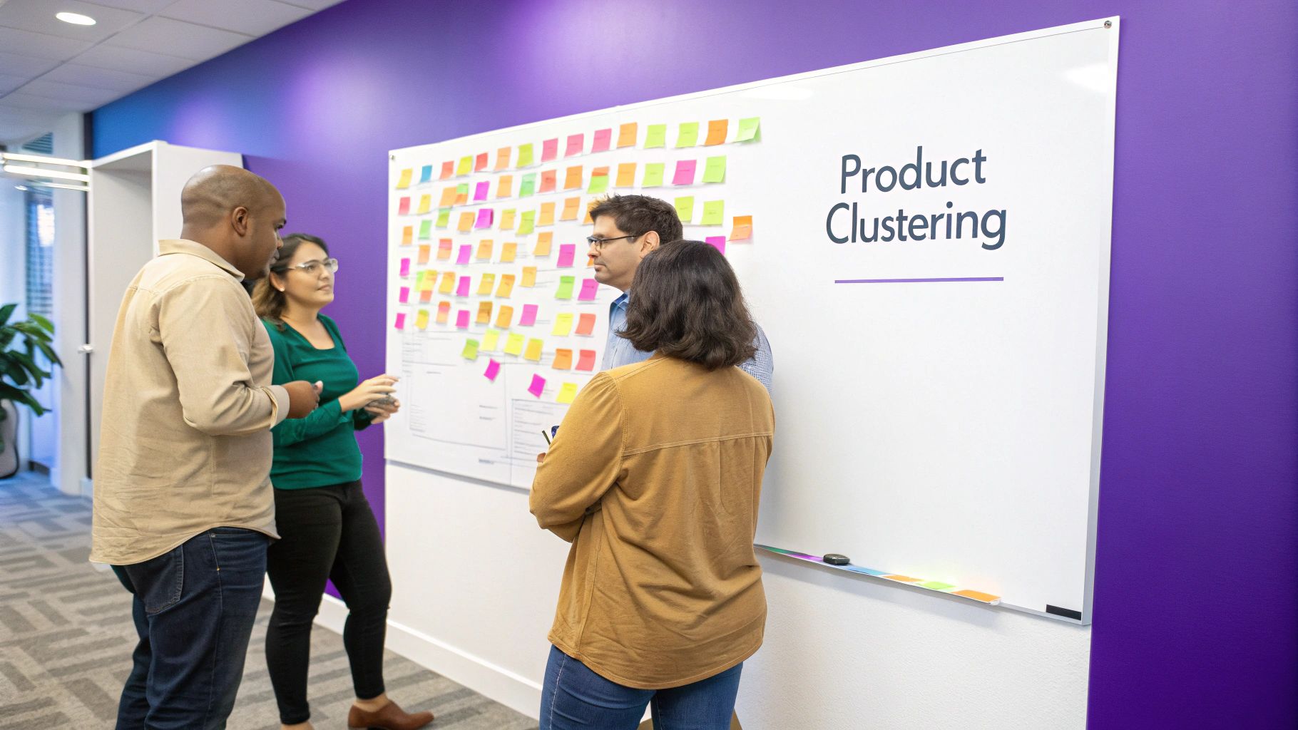
This approach is especially useful when dealing with a large volume of inputs, as it helps break down complex product requirements into manageable segments. By visually grouping related items, teams can easily identify core themes and prioritize development efforts accordingly. Features of this method include the ability to organize large volumes of customer feedback and feature requests, identify natural groupings of product requirements, and utilize color-coding for different stakeholder inputs. Digital tools like Miro or Mural are often used to implement this process collaboratively, making it ideal for distributed teams.
Examples of successful implementation: Companies like Apple, Tesla, and Spotify have reportedly used affinity diagrams during their product development processes. Apple leverages this method to organize user experience feedback for iOS features, Tesla uses it to categorize and prioritize dashboard interface features, and Spotify’s development team employs it to organize listener feature requests into their agile roadmap. These examples showcase the versatility and effectiveness of affinity diagrams across different industries and product types. This is a great affinity diagram example, and should be considered by product teams looking for a collaborative way to make sense of customer feedback.
Tips for effective use:
- Involve diverse perspectives: Include representatives from design, engineering, marketing, and customer support in the grouping process to ensure a holistic understanding of user needs.
- Embrace digital collaboration: Utilize online whiteboarding tools like Miro or Mural for seamless remote team collaboration and real-time updates.
- Start small: Limit the initial sorting to 50-100 items to prevent overwhelm and maintain focus. For larger datasets, consider breaking the process down into smaller, more manageable chunks.
- Create a parking lot: Designate a space for outliers or ideas that don't immediately fit into clear categories. This prevents valuable insights from being discarded and allows for further exploration later.
Pros:
- Breaks down complex information into manageable segments
- Facilitates consensus and shared understanding
- Reveals hidden connections and patterns
- Prioritizes development based on clustered importance
Cons:
- Can become unwieldy with excessive inputs
- Subjective grouping can introduce bias
- Requires careful facilitation to avoid dominant voices
Learn more about Product Development Affinity Diagram
By following these tips and understanding the potential pitfalls, you can effectively leverage affinity diagrams to improve your product development process and create products that truly resonate with your target audience. This method is highly recommended for any remote team, remote tech team, or remote startup looking to enhance collaboration and streamline their product development workflow.
2. Customer Experience Journey Mapping
Customer Experience Journey Mapping is a powerful application of affinity diagramming that provides a visual representation of every interaction a customer has with a product or service. It meticulously lays out the customer's journey from initial awareness to post-purchase engagement, grouping related experiences, highlighting pain points, and showcasing moments of delight. This method allows businesses to understand the customer's perspective, identify areas for improvement, and ultimately optimize the entire customer experience. It works by systematically plotting each touchpoint a customer encounters—from website visits and social media interactions to customer service calls and product usage—and analyzing the associated emotions and feedback at every stage. This creates a comprehensive overview of the entire customer lifecycle.
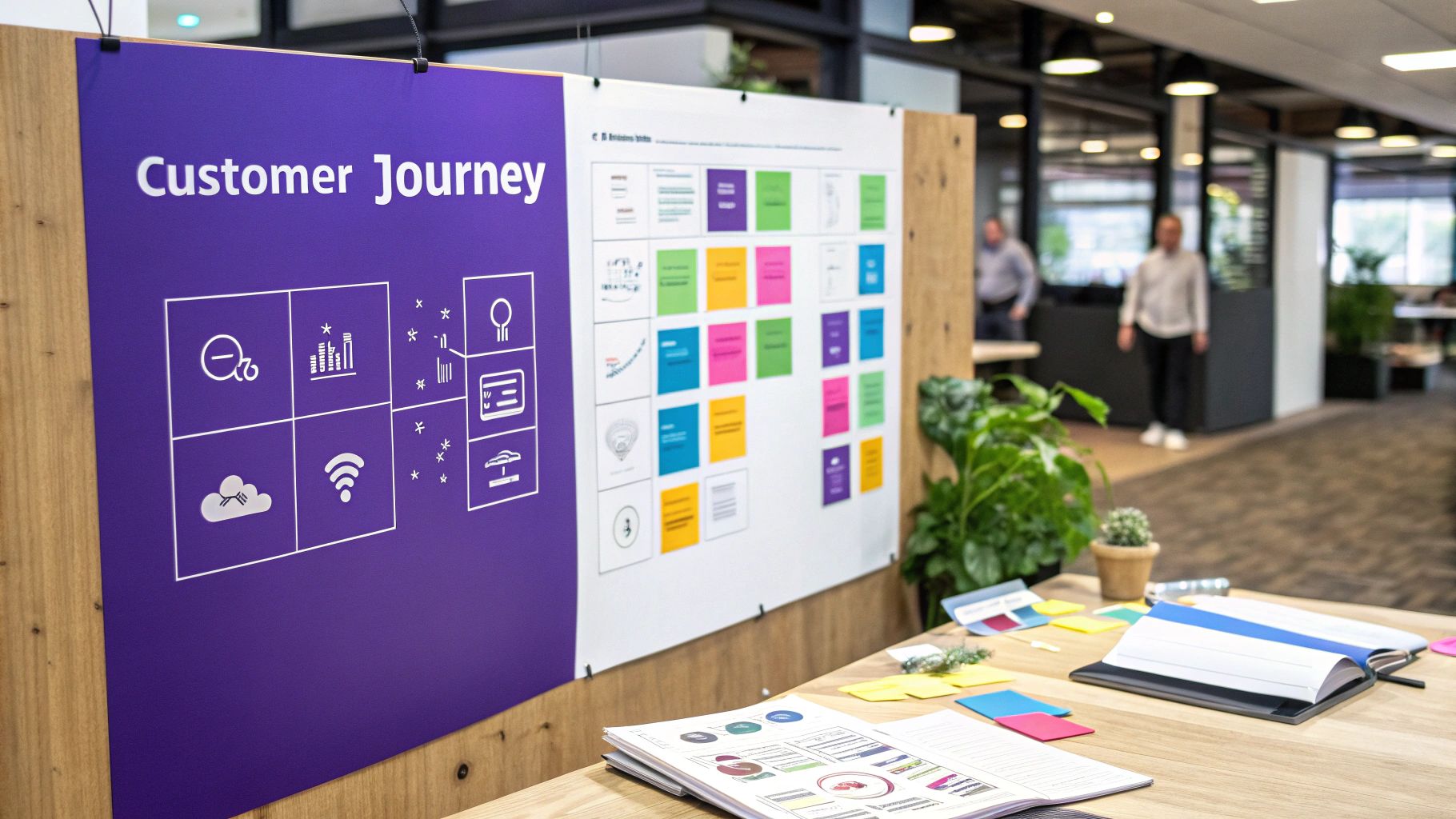
This affinity diagram example deserves its place on the list due to its direct impact on customer satisfaction and retention, crucial factors for any business, especially remote startups. Its visual nature makes it easy for remote teams to collaboratively analyze and understand the customer experience, regardless of their physical location. Key features include the temporal organization of customer interactions, emotional mapping alongside functional touchpoints, cross-channel experience integration, and a clear visual representation of the entire customer journey. This provides a holistic view of the customer’s interaction with the product or service, making it an invaluable tool for remote tech teams aiming to improve user experience.
For remote teams, startups, and tech companies, this visual approach is particularly beneficial. It fosters shared understanding across distributed teams and facilitates asynchronous collaboration. The visual representation makes it easy to identify pain points and discuss solutions, regardless of team members' locations or time zones.
Examples of successful implementation:
- Disney: Uses journey mapping to understand and smooth out friction points in their theme park visitor experience, ensuring a magical and seamless experience for all guests.
- Amazon: Leverages journey mapping to optimize the e-commerce purchasing process, focusing on streamlining navigation, checkout, and delivery, ultimately enhancing customer satisfaction and driving repeat purchases.
- Mayo Clinic: Employs patient experience journey mapping to improve healthcare delivery, identifying areas where patient care can be enhanced and streamlined.
Actionable Tips:
- Ground your map in reality: Begin with actual customer research (surveys, interviews, user testing) rather than relying on assumptions about the customer experience.
- Segment your audience: Create separate journey maps for distinct customer personas to address specific needs and pain points of various user groups.
- Visualize emotions: Use sticky notes color-coded by emotion or pain level to quickly identify areas requiring immediate attention.
- Prioritize emotional impact: Reorganize the diagram based on the intensity of emotion rather than strict chronological order to pinpoint critical areas for improvement.
Pros:
- Unveils crucial "moments of truth" in the customer experience.
- Pinpoints service gaps and identifies redundant processes.
- Aligns cross-functional teams around customer-centric improvements.
- Provides a clear visual representation of complex multi-channel interactions.
Cons:
- Can oversimplify diverse customer segments by condensing them into a single journey.
- Can be time-intensive to create and maintain, requiring ongoing updates and revisions.
- May overemphasize the current state of the customer journey at the expense of future possibilities and innovation.
Customer Experience Journey Mapping is particularly useful when launching a new product or service, redesigning an existing offering, or addressing recurring customer complaints. By understanding the complete customer journey, remote teams can effectively collaborate to enhance user satisfaction, improve product adoption, and ultimately drive business growth. While organizations like the Service Design Network, Nielsen Norman Group, and Customer Experience Professionals Association have popularized this method, its practical application transcends specific industries, offering valuable insights for any business focused on customer-centricity.
3. Root Cause Analysis Affinity Diagram
A Root Cause Analysis Affinity Diagram is a powerful tool for remote teams, tech teams, and startups looking to identify the underlying causes of complex problems. It's a specific application of the affinity diagram method focused on troubleshooting and quality improvement. Essentially, it's a visual way to organize a large amount of information (like observations, defects, or incidents) into natural groupings, revealing hidden patterns and the true source of your issues. This makes it a valuable affinity diagram example, especially in situations where traditional brainstorming might miss the systemic issues.
This approach is particularly useful in remote settings where clear communication and collaborative problem-solving are crucial. Imagine your remote tech team is experiencing recurring bugs in a software release. Instead of simply patching each bug individually, a Root Cause Analysis Affinity Diagram can help your team uncover the deeper issues in the development process contributing to these bugs.
Here's how it works: Your team begins by gathering data related to the problem. This could involve logging error messages, documenting user complaints, or recording instances of the issue. Then, each piece of data is written on a sticky note (virtual or physical). These notes are then grouped together based on their natural relationships. This grouping process is iterative, with the team discussing and rearranging the notes until clusters emerge that represent potential root causes.
Features of this approach include:
- Fishbone (Ishikawa) diagram integration: The resulting groupings can often be easily translated into a Fishbone diagram to visually represent the cause-and-effect relationships.
- Categorization of causes by source: This allows teams to categorize issues based on sources such as man, machine, method, material, measurement, or environment, helping to pinpoint responsibility and potential solutions.
- Hierarchical organization of primary and secondary causes: This reveals the layers of complexity contributing to the main problem.
- Data-driven grouping of incidents or defects: Emphasis is placed on using actual data rather than relying on assumptions.
Pros:
- Surfaces systemic issues rather than just addressing surface-level symptoms.
- Prevents quick-fix approaches that don't solve the underlying problem.
- Creates a shared understanding of multifaceted issues across the remote team.
- Depersonalizes problem identification, allowing the team to focus on systems and processes.
Cons:
- Can be overly complex for simple problems.
- Requires significant data collection before the diagramming process can begin.
- May lead to analysis paralysis if clear action steps aren't defined after the root causes are identified.
Examples of Successful Implementation:
- Toyota Production System uses this method to identify quality defect patterns.
- GE's Six Sigma teams utilize affinity diagrams in DMAIC improvement cycles.
- NASA uses them for spacecraft anomaly investigations and failure analysis.
Actionable Tips for Remote Teams:
- Start with the "5 Whys" technique to generate initial input data. Ask "why" repeatedly until you get to the root of the issue.
- Use actual incident data rather than hypothetical causes. Encourage your team to share concrete examples and evidence.
- Include representatives from all affected departments or teams to ensure a comprehensive perspective.
- Create action plans for each major grouping identified to translate insights into tangible improvements. Learn more about Root Cause Analysis Affinity Diagram
Why this method deserves its place on the list: The Root Cause Analysis Affinity Diagram is a powerful affinity diagram example because it provides a structured and collaborative approach to problem-solving. It goes beyond surface-level fixes to address the root causes of complex issues. This is particularly valuable for remote teams, tech teams, and startups, who often face intricate challenges requiring a deep understanding of interconnected systems. This method promotes a data-driven approach, reducing the risk of biased assumptions and encouraging a shared understanding of the problem.
4. UX Research Synthesis Affinity Diagram
A UX Research Synthesis Affinity Diagram is a powerful way to analyze and interpret qualitative user research data. This affinity diagram example specifically focuses on transforming messy data like user interview transcripts, usability test observations, and field notes into organized groups and themes. By visually clustering related observations, UX researchers can uncover meaningful insights into user behaviors, needs, and pain points, ultimately leading to more informed design decisions. This method is particularly helpful for remote teams who need to collaborate effectively on user research analysis, regardless of location.
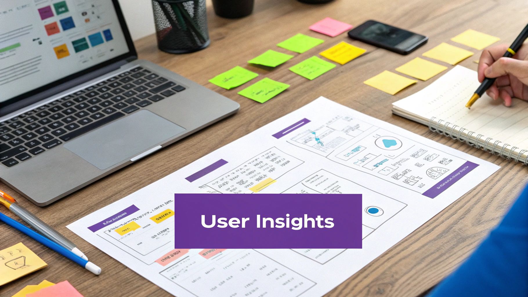
The process involves transcribing user interviews and writing down individual observations or quotes on sticky notes (one per note). Using the users' exact words is crucial to avoid misinterpretations. Then, the team collaboratively groups related sticky notes, forming clusters based on emerging themes. These themes represent key insights about the user experience. For instance, a cluster might reveal a common user frustration with a specific feature or a widespread need for a particular functionality. This visual representation helps remote teams quickly grasp the key takeaways from the research, facilitating asynchronous collaboration and discussion.
Companies like Google, Airbnb, and Microsoft have successfully used UX Research Synthesis Affinity Diagrams to inform their design processes. For example, Google's UX team utilizes affinity diagrams to synthesize findings from global user studies, ensuring a user-centered approach to product development. Similarly, Airbnb leveraged this technique to enhance the host onboarding experience, leading to improved user satisfaction. Learn more about UX Research Synthesis Affinity Diagram for practical tips on facilitating remote workshops, especially valuable for distributed UX teams.
Key Features of a UX Research Synthesis Affinity Diagram:
- Verbatim quote organization: Directly uses user quotes for accuracy.
- Theme identification: Uncovers recurring patterns across participants.
- Insight clustering: Groups themes based on user needs or pain points.
- Visualization of research findings: Creates a shared understanding among stakeholders.
Pros:
- Transforms qualitative data into actionable insights.
- Reduces confirmation bias in research analysis.
- Facilitates shared understanding within remote teams.
- Prioritizes design improvements based on frequency and impact.
Cons:
- Requires time-consuming transcription and note preparation.
- Can be challenging to manage with large datasets.
- Needs experienced facilitators to guide the process effectively.
Tips for Remote Teams:
- Write one observation or quote per digital sticky note in a collaborative whiteboard tool.
- Use the exact words of users, avoiding paraphrasing.
- Involve the entire research team in the virtual grouping process.
- Take screenshots of the evolving diagram and create digital documentation.
- Highlight the most impactful findings for easy sharing and reference.
This method deserves a place on this list because it's specifically tailored for UX research and offers a structured approach to understanding user needs, especially crucial for remote teams who may face communication and collaboration challenges. By prioritizing user feedback and facilitating shared understanding, the UX Research Synthesis Affinity Diagram helps remote teams build user-centered products and services more effectively.
5. Business Process Improvement Affinity Diagram
This affinity diagram example focuses on streamlining workflows and enhancing efficiency within an organization. A Business Process Improvement Affinity Diagram is a powerful visual tool used to identify, organize, and prioritize areas for improvement within business processes. It’s particularly valuable for remote teams, tech startups, and remote tech teams as it fosters collaboration, clarifies complex processes, and drives consensus even when team members are geographically dispersed. This method leverages the core principles of affinity diagramming to bring clarity to complex processes, making it an invaluable tool for process reengineering and continuous improvement initiatives.
How it Works:
The process begins by mapping the current “as-is” process, involving all stakeholders, from frontline staff to management. This ensures a comprehensive understanding of the workflow. Then, participants brainstorm and write down on sticky notes all observed inefficiencies, bottlenecks, pain points, and potential areas for improvement. These notes are then grouped based on their natural relationships or "affinity" to each other, creating clusters that represent key problem areas. These clusters are then labeled, revealing systemic issues rather than isolated incidents. Finally, the team prioritizes these grouped areas for improvement based on factors like impact and feasibility.
Examples of Successful Implementation:
- IBM's business process reengineering initiatives for client services: IBM utilized affinity diagrams to overhaul their client service workflows, improving response times and client satisfaction.
- Kaiser Permanente's patient discharge process optimization: By using affinity diagrams, Kaiser Permanente streamlined their patient discharge process, reducing wait times and improving patient flow.
- Deloitte's internal consulting workflow improvements: Deloitte leveraged this method to improve their internal consulting processes, resulting in increased efficiency and project delivery success.
Actionable Tips for Readers:
- Map the current process completely before identifying improvement areas: A thorough understanding of the existing workflow is crucial for effective analysis. Tools like flowcharts can be helpful for remote teams to visualize the process together.
- Include both frontline staff and management in the diagramming session: Diverse perspectives are vital for identifying all potential issues and ensuring buy-in across the organization. Virtual whiteboarding tools can facilitate remote collaboration.
- Categorize improvements by implementation difficulty and impact: This allows for strategic prioritization of changes, focusing on high-impact, low-effort improvements first.
- Create clear ownership for each improvement category identified: Assign responsibility to individuals or teams for addressing each area, ensuring accountability and follow-through. Project management software can help track progress and responsibilities.
- Use a RACI matrix alongside affinity groupings to clarify responsibility: This further clarifies roles and responsibilities (Responsible, Accountable, Consulted, Informed) for each improvement area.
When and Why to Use This Approach:
This approach is particularly useful when:
- Dealing with complex processes involving multiple stakeholders: The visual nature of the diagram helps to break down complexity and foster shared understanding across remote teams.
- Seeking to identify systemic issues rather than isolated problems: Affinity diagramming reveals patterns and connections between seemingly disparate issues.
- Aiming to build consensus on improvement priorities: The collaborative process promotes buy-in and shared ownership of solutions.
- Working with remote teams to improve asynchronous communication and collaboration: Digital affinity diagramming tools can facilitate this process seamlessly.
Pros:
- Identifies systemic process issues rather than isolated inefficiencies.
- Creates consensus on improvement priorities across departments, even remote ones.
- Visualizes complex processes in understandable groupings.
- Helps overcome organizational silos by showing interdependencies.
Cons:
- Can become politically charged when inefficiencies cross department boundaries.
- Requires executive sponsorship to implement identified changes.
- May reveal structural organizational problems beyond the scope of process improvement.
This affinity diagram example deserves its place in the list because it provides a practical and effective framework for process optimization, especially valuable for distributed teams. By visually representing the interconnectedness of process elements, it promotes a shared understanding and facilitates collaborative problem-solving. This leads to more targeted and impactful process improvements, ultimately contributing to greater efficiency and organizational success.
6. Strategic Planning KJ Method Affinity Diagram
The Strategic Planning KJ Method Affinity Diagram provides a robust framework for tackling complex strategic challenges, going beyond brainstorming and basic affinity diagramming. Grounded in the KJ Method developed by Jiro Kawakita, it employs a structured, facilitated approach to synthesize diverse perspectives and forge a unified strategic direction. This method is particularly effective for remote teams who need a structured way to collaborate on strategic planning.
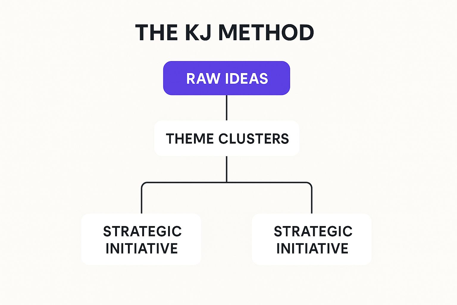
The infographic above visually represents the hierarchical structure of the KJ Method for strategic planning. At the highest level is the overarching strategic challenge or question. This breaks down into primary themes, representing key areas of focus. These primary themes are further divided into secondary groupings, reflecting specific strategies or initiatives. Finally, individual ideas and insights contribute to these secondary groupings as tertiary elements. This hierarchical structure helps to organize the complex web of information into a manageable and actionable framework. The infographic emphasizes the importance of structured facilitation and silent sorting as crucial elements throughout the process, culminating in a clear strategic direction.
This method stands out for its unique features, including a strict facilitation protocol with silent sorting and hierarchical organization with primary, secondary, and tertiary groupings. It incorporates relationship mapping between strategic themes and builds in voting and prioritization mechanisms. This makes it an excellent affinity diagram example for strategic planning.
This rigorous process offers several advantages:
- Prevents Groupthink: Silent sorting ensures all voices are heard, minimizing the influence of dominant personalities, a common challenge for remote teams.
- Surfaces Unexpected Connections: The structured approach can reveal hidden relationships between strategic elements, leading to more innovative solutions.
- Equalizes Input: It provides a level playing field for participants from different organizational levels within a distributed team.
- Creates Strong Consensus: Structured participation fosters buy-in and a shared understanding of the strategic direction.
However, it's also important to consider the drawbacks:
- Time-Consuming: The KJ Method requires a more significant time investment than simpler affinity diagramming techniques.
- Requires Skilled Facilitation: Maintaining process discipline necessitates a skilled facilitator to guide the remote team effectively.
- Can Feel Rigid: Participants accustomed to less structured brainstorming sessions might find the process overly formal.
The KJ Method has been successfully implemented in various contexts, including Honda's product development, Singapore's urban planning, and 3M's innovation strategies. These diverse examples highlight its adaptability and effectiveness for complex problem-solving.
For remote teams utilizing the KJ Method, the following tips are essential:
- Enforce Silent Sorting: Strictly adhere to silent sorting rules to prevent social influence during online collaboration.
- Round-Robin Header Creation: Ensure balanced input by using a round-robin approach for creating headers and themes.
- Plan for a Full Day: Don’t rush the process. Allocate sufficient time for thorough discussion and analysis.
- Document Thoroughly: Create clear documentation of both the process and outcomes for future reference.
- Follow Up with Relationship Diagrams: Connect the major themes visually to further clarify relationships and interdependencies.
The Strategic Planning KJ Method Affinity Diagram deserves a place on this list because it offers a structured and robust approach to strategic planning, especially valuable for remote teams needing a framework for effective collaboration. By following these guidelines and understanding the nuances of this method, organizations can leverage its power to address complex challenges and create a shared vision for the future.
6 Affinity Diagram Types Comparison
| Affinity Diagram Type | Implementation Complexity 🔄 | Resource Requirements 💡 | Expected Outcomes 📊 | Ideal Use Cases 💡 | Key Advantages ⭐ |
|---|---|---|---|---|---|
| Product Development Affinity Diagram | Medium – requires facilitation and digital tools | Cross-functional teams, collaboration platforms | Prioritized product backlog, clear feature clusters | Organizing user feedback, feature prioritization | Breaks down complex requirements; fosters consensus; reveals hidden connections |
| Customer Experience Journey Mapping | High – time-intensive with emotional mapping | Customer research data, cross-channel insights | Visualized customer journey, identified pain points | Mapping customer interactions and emotions | Reveals moments of truth; aligns teams; uncovers service gaps |
| Root Cause Analysis Affinity Diagram | High – data-intensive and hierarchical grouping | Incident data, multi-department involvement | Identification of systemic issues and root causes | Troubleshooting, quality improvement in manufacturing | Surfaces systemic issues; prevents quick fixes; depersonalizes problems |
| UX Research Synthesis Affinity Diagram | Medium-High – labor-intensive transcription | UX research data, experienced facilitators | Structured user insights, design priorities | Synthesizing qualitative user research findings | Transforms qualitative data; reduces bias; shared understanding |
| Business Process Improvement Affinity Diagram | Medium – requires cross-functional input and mapping | Stakeholders from multiple departments | Prioritized process improvements and workflow clarity | Business process reengineering, continuous improvement | Identifies systemic issues; creates consensus; visualizes process interdependencies |
| Strategic Planning KJ Method Affinity Diagram | Very High – strict protocol and skilled facilitation | Skilled facilitator, full-day sessions | Consensus-driven strategic themes and priorities | Complex strategic planning and problem-solving | Prevents groupthink; surfaces unexpected links; equalizes input |
Transforming Brainstorming with Affinity Diagrams and Bulby
From product development and customer journey mapping to UX research and strategic planning, the affinity diagram examples explored in this article demonstrate the remarkable versatility of this technique. Key takeaways include the ability to effectively organize complex information, identify underlying patterns, and facilitate shared understanding within a team. Mastering these approaches empowers remote teams, like yours, to transform brainstorming sessions from chaotic idea generation into focused, insightful discussions that yield innovative solutions. While affinity diagrams are great for organizing ideas, consider incorporating other proven brainstorming strategies to further enhance creativity and action within your team. By implementing affinity diagramming as a regular practice, you can unlock the full potential of your team's collaborative power, leading to more efficient problem-solving and impactful decision-making.
Ready to streamline your affinity diagramming process and supercharge your remote team's brainstorming sessions? Explore the power of Bulby, a platform designed to facilitate collaborative affinity diagram creation, providing a centralized hub for your team to contribute, organize, and analyze ideas effectively, no matter where they are. Start your free trial today and experience the difference a structured approach to affinity diagramming can make.
