
In today's remote and hybrid work environments, organizing a flood of ideas, feedback, and data can feel chaotic. Teams are often spread across time zones, making collaborative synthesis a major challenge. The affinity diagram is a simple yet powerful tool for transforming scattered information into structured, actionable insights. While originally developed for quality management, this technique has become essential for UX researchers, product managers, and marketers.
This article dives straight into practical, real-world affinity diagrams examples, demonstrating how this method helps teams find clarity and build consensus, no matter where they are. We will explore six distinct scenarios, from sorting customer feedback to categorizing software bugs. For each example, you will get a strategic breakdown and replicable tactics you can implement immediately with your own team.
Instead of just theory, this guide provides a blueprint for turning messy brainstorming sessions or complex user research into your next big breakthrough. You'll learn how to group raw data into meaningful themes, uncover hidden patterns, and create a clear foundation for decision-making. Let's explore how to move from disorganized data to decisive action.
1. Customer Feedback Analysis for Product Development
One of the most powerful and common applications of affinity mapping is transforming vast amounts of raw customer feedback into a clear, actionable product development strategy. This process involves collecting qualitative data from various channels, then systematically grouping individual comments and requests to uncover underlying themes, pain points, and opportunities.
For remote and hybrid teams, this method is especially valuable. It creates a shared, visual understanding of the customer's voice, ensuring that product decisions are driven by genuine user needs rather than internal assumptions. For instance, a distributed product team might gather hundreds of data points from user interviews, support tickets, and social media mentions. By placing each piece of feedback onto a digital whiteboard, they can collaboratively sort them into logical groups, moving from chaos to clarity.
Strategic Breakdown and Analysis
The core strategy here is emergent categorization. Instead of starting with predefined buckets, the team lets the categories emerge naturally from the data itself. This bottom-up approach prevents confirmation bias and reveals unexpected insights.
- Initial Data Dump: All raw feedback is placed onto a shared digital canvas (e.g., Miro, Mural). Each note is a direct quote or a summary of a single piece of feedback.
- Silent Grouping: Team members silently drag and drop related notes together. This non-verbal phase encourages focus and prevents dominant voices from influencing the outcome.
- Theme Naming: Once clusters form, the team collaboratively discusses each group and assigns it a descriptive name. This name should capture the essence of the customer need, such as "Difficulty Finding Advanced Settings" or "Request for Mobile Offline Access."
Key Insight: The true power of this technique lies in its ability to quantify qualitative data. By seeing the size of each cluster, teams can visually grasp the priority of different issues. A large cluster of notes about a specific bug immediately signals a high-priority problem.
To get the most out of this process, it's helpful to understand the different ways you can collect and interpret user insights. To deepen your understanding of interpreting customer insights, exploring various customer feedback analysis methods can be highly beneficial.
Real-World Impact and Actionable Takeaways
Many successful products were shaped by insights derived from this method. For example, Dropbox developed its Smart Sync feature after affinity mapping revealed a significant cluster of feedback from users struggling with local storage limits. This direct line from customer pain to product feature is a hallmark of effective feedback analysis.
This quick reference summarizes the key data points you'll organize in this type of affinity diagram.
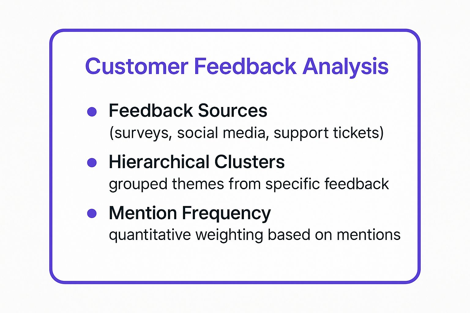
As the infographic highlights, the process moves from broad data sources to specific, weighted themes that directly inform your roadmap. This structured approach ensures your team focuses on what truly matters to users. For remote teams looking to implement this, leveraging the right software is crucial. You can find many powerful options and learn more about the best tools for remote product development.
2. User Experience Research Synthesis
A cornerstone of human-centered design, user experience (UX) research synthesis uses affinity diagrams to make sense of complex human behaviors. Researchers gather qualitative data from user interviews, usability tests, and field observations, then map individual data points to uncover patterns. This process transforms a jumble of quotes, actions, and frustrations into coherent themes that guide everything from feature prioritization to persona creation.
For remote UX teams, this methodology is indispensable. It allows researchers, designers, and stakeholders scattered across different locations to collaboratively immerse themselves in user data. Using a digital whiteboard, they can collectively organize hundreds of observations, ensuring that the final design decisions are grounded in a shared, deep understanding of the user’s world. This is one of the most classic affinity diagrams examples because it directly translates empathy into action.
Strategic Breakdown and Analysis
The primary strategy is to find the story in the data. UX synthesis isn't just about grouping similar items; it's about building a narrative that explains user motivations, goals, and challenges. The themes that emerge become the chapters of that story.
- Initial Data Dump: Every observation, quote, or user action is placed on its own digital sticky note. These are "atomic" insights, representing the smallest meaningful piece of data.
- Silent Grouping: Team members independently group the notes based on behavioral or attitudinal similarities. This non-verbal step prevents premature conclusions and allows patterns to form organically.
- Theme Naming and Hierarchy: Once clusters are formed, the team collaboratively names them. Often, a hierarchy is created, with low-level groups (e.g., "Users struggled to find the save button") rolling up into higher-level themes (e.g., "Poor Discoverability of Core Actions").
Key Insight: This process excels at revealing the "why" behind user behavior. A cluster of notes might show that many users abandoned a task at the same point. The synthesis process helps the team dig deeper to understand if the cause was a confusing interface, a missing feature, or an external distraction.
To structure the initial data gathering, many teams use frameworks to ensure comprehensive feedback. For a deeper dive into structuring these sessions, learning about the “I Like, I Wish, What If” method can provide a robust foundation for your synthesis work.
Real-World Impact and Actionable Takeaways
This technique is fundamental to the work of major tech companies. For instance, Microsoft heavily relied on UX research synthesis when redesigning its Office suite interface, using affinity mapping to consolidate feedback from millions of users into actionable design principles. Similarly, Adobe uses this method to guide improvements across its Creative Cloud platform, ensuring new features align with the evolving workflows of creative professionals.
By involving stakeholders like product managers and engineers in the synthesis session, UX researchers build cross-functional buy-in from the start. When a developer sees a cluster of ten user quotes all describing the same pain point, the need for a fix becomes undeniable. This shared context eliminates lengthy debates and aligns the entire team around solving real user problems, making it a powerful tool for any product organization.
3. Brainstorming Session Organization
Affinity diagrams are a cornerstone of effective brainstorming, providing a structured method to sift through a torrent of raw ideas and find meaningful patterns. Teams use this technique to take individual concepts generated during a creative session and group them into related themes, turning a chaotic collection of thoughts into an organized framework for action.
This method is indispensable for remote and hybrid teams conducting virtual brainstorming sessions. It ensures that every idea, regardless of who contributed it, is seen and considered. By using a digital whiteboard, distributed teams can collectively categorize ideas, which prevents good concepts from being lost and often reveals surprising connections that spark even greater innovation.

Strategic Breakdown and Analysis
The central strategy is to separate ideation from organization. This two-phase approach allows for uninhibited creative thinking first, followed by a logical and collaborative sorting process. This prevents premature judgment and helps the team see the bigger picture.
- Idea Generation: The session begins with a clear prompt, often framed as a "How Might We…" question to encourage actionable ideas. Team members add their thoughts as individual notes on a shared canvas without discussion or critique.
- Collaborative Sorting: Once the idea generation phase concludes, the team works together, often silently at first, to drag and drop related ideas into clusters. This non-verbal sorting helps prevent influential voices from guiding the process and allows natural patterns to emerge.
- Theme Identification: After clusters have formed, the group collaboratively discusses each one and assigns a concise, descriptive header. These headers, like "Streamlining Internal Communication" or "New Gamification Features," become the main takeaways from the brainstorm.
Key Insight: This process transforms an unstructured brainstorm into a visual map of the team's collective thinking. It highlights where the most creative energy is focused and identifies unique "orphan" ideas that might warrant further exploration.
To ensure your brainstorming sessions are productive from start to finish, it's vital to have a well-defined process. You can enhance your team's creative output by exploring a structured guide on the essential steps of the brainstorming process.
Real-World Impact and Actionable Takeaways
This method is a staple in world-class innovation labs. For instance, 3M's legendary innovation culture relies on affinity mapping to sort through new product concepts, while Stanford's d.school and IBM's Design Thinking framework embed it directly into their ideation workshops. They use it to move from wide-ranging possibilities to focused, testable hypotheses.
A key takeaway is that affinity mapping makes prioritization easier. Once themes are identified, teams can use follow-up techniques like dot voting or an impact-effort matrix to decide which clusters represent the most promising opportunities. This creates a clear and democratic path from idea to execution, ensuring that the best concepts move forward.
4. Root Cause Analysis in Quality Management
A critical application of affinity diagrams is in root cause analysis (RCA), particularly within quality management frameworks like Six Sigma and Lean Manufacturing. This method helps teams move beyond surface-level symptoms to uncover the fundamental, systemic causes of defects, safety incidents, or operational failures. By organizing disparate observations and data points, teams can visualize patterns that point to deeper process or system-wide issues.
For remote and hybrid organizations, especially in manufacturing or service industries, this technique provides a structured way to collaboratively solve complex problems. A distributed quality assurance team, for instance, can gather data from incident reports, automated system logs, and operator feedback from different locations. Using a digital affinity map, they can sort these inputs to identify the true drivers of a recurring issue, ensuring that corrective actions are effective and long-lasting.
Strategic Breakdown and Analysis
The strategy here is to use systemic categorization to understand the interplay of different factors contributing to a problem. Instead of just brainstorming solutions, the team first focuses on organizing all potential causes to see the bigger picture. This approach ensures that solutions address the root of the problem, not just its effects.
- Initial Data Collection: Gather all information related to a specific quality issue or incident. This includes employee observations, machine readings, process documentation, and customer complaints, which are then added to a shared board.
- Silent Grouping: Team members, especially frontline workers who experience the process daily, silently group related data points. This empowers those with direct knowledge and prevents a few voices from steering the conversation.
- Theme Naming (Cause Categories): Clusters are then labeled using established quality management frameworks, often called the "5Ms" or "6Ms": Man (People), Machine (Equipment), Method (Process), Material, Measurement, and Milieu (Environment). This provides a structured way to analyze the problem from all angles.
Key Insight: The power of this method in RCA is its ability to reveal interconnected failures. A problem initially attributed to "human error" might, through affinity mapping, be traced back to poor training (Man), confusing interface design (Machine), and an outdated procedure (Method), showing it’s a systemic issue, not an individual one.
This disciplined approach is essential for any team committed to continuous improvement. To build your team's capabilities in this area, you can learn more about structured problem-solving techniques.
Real-World Impact and Actionable Takeaways
This technique is a cornerstone of Toyota's renowned Production System, where it is used to relentlessly eliminate waste and improve quality. When a defect is found on the assembly line, teams use affinity mapping to understand all contributing factors, leading to process improvements that prevent recurrence. Similarly, healthcare systems use it to analyze patient safety incidents, clustering data to find systemic risks in their clinical workflows.
This approach transforms blame-focused investigations into constructive, system-oriented problem-solving. By visualizing all potential causes, teams can pinpoint where the system failed and implement robust countermeasures, ensuring higher quality and safer operations. It makes problem-solving a collaborative, data-driven exercise rather than an accusatory one.
5. Market Research and Customer Segmentation
Affinity diagrams are a cornerstone for marketing teams aiming to move beyond broad demographic data and understand the nuanced motivations driving customer behavior. This method is used to process qualitative market research data, such as interviews, focus group transcripts, and open-ended survey responses, to uncover distinct customer segments. By grouping individual behaviors, preferences, and pain points, teams can build rich, actionable customer archetypes or personas.

This process is particularly effective for remote marketing teams, as it provides a collaborative, visual framework to synthesize diverse data points into a unified vision of the target audience. For instance, a distributed team at a company like HubSpot could analyze customer data to develop its well-known persona methodology, sorting thousands of data points on a digital whiteboard to identify the core needs and goals that define different user types. This ensures that all marketing efforts, from content creation to ad campaigns, are grounded in a deep, shared understanding of the customer.
Strategic Breakdown and Analysis
The central strategy is to identify behavioral patterns over demographic similarities. Instead of grouping customers by age or location, the focus is on why they make certain choices. This approach aligns closely with frameworks like Clayton Christensen's Jobs-to-be-Done theory, which seeks to understand the "job" a customer is "hiring" a product to do.
- Initial Data Dump: Collate data from multiple sources, including surveys, customer interviews, and behavioral analytics. Each note on the affinity map should represent a single behavior, motivation, or characteristic (e.g., "Listens to podcasts during commute," "Values eco-friendly packaging").
- Silent Grouping: Team members organize the notes into clusters based on perceived similarities in lifestyle, goals, or challenges. This step reveals natural groupings without premature labeling.
- Segment Naming and Persona Creation: Once clusters are stable, the team collaboratively names each segment (e.g., "The Time-Strapped Professional," "The Budget-Conscious Family"). These groups then form the basis for detailed persona documents that guide marketing strategy.
Key Insight: Affinity mapping for segmentation uncovers the "why" behind customer actions. A company might find that two demographically different customers buy the same product for entirely different reasons. Recognizing these distinct "jobs-to-be-done" allows for much more precise and effective marketing messages.
Real-World Impact and Actionable Takeaways
This technique has shaped the strategies of numerous global brands. Spotify famously used affinity mapping of listening behaviors and user interviews to identify distinct taste segments, leading to hyper-personalized features like Discover Weekly. Similarly, Nike conducted extensive customer lifestyle research, using affinity diagrams to group insights and develop targeted product lines for segments like urban runners and trail enthusiasts.
By using affinity diagrams for customer segmentation, your team can move from generic campaigns to highly resonant, targeted communication. This structured approach ensures that product positioning and marketing messages align directly with the real-world needs and contexts of your most valuable customer segments. This method helps teams create empathetic and effective strategies. To learn more about building customer empathy, you can explore resources on how to create and use empathy maps.
6. Software Development Bug Categorization
A core challenge for any software development team is managing the constant influx of bug reports, technical debt items, and user-reported issues. Using an affinity diagram to categorize and prioritize these items transforms a reactive, often chaotic process into a strategic, data-driven approach to improving software quality and stability.
This method is especially effective for distributed engineering teams, as it creates a single source of truth for understanding the health of the application. Instead of tackling bugs in the order they arrive, teams can visualize patterns and hotspots. For example, a remote team can pull data from Jira tickets, Sentry error logs, and customer support channels onto a digital whiteboard. By grouping individual reports, they can identify systemic problems that require deeper architectural changes rather than simple patch fixes.
Strategic Breakdown and Analysis
The central strategy here is to move beyond individual bug reports and identify systemic failure patterns. This allows teams to allocate resources to fixes that deliver the highest impact, improving the user experience and reducing future technical debt. The process is rooted in collaborative sense-making, turning isolated incidents into a holistic view of product quality.
- Initial Data Dump: All bug reports, user complaints, and logged errors are compiled onto a shared digital space. Each note should contain the issue summary and its source (e.g., "User A reports login timeout – Support Ticket #123").
- Silent Grouping: Engineers, QA analysts, and even customer support members silently group related reports. One person might cluster all reports related to payment failures, while another gathers issues about slow dashboard loading times.
- Theme Naming: The team discusses the formed clusters and assigns them clear, actionable names. These themes move from specific symptoms to underlying causes, such as "API Rate Limiting Errors," "Database Connection Pool Exhaustion," or "Cross-Browser CSS Rendering Bugs."
Key Insight: This technique helps teams prioritize not just by technical severity but by customer impact. A cluster of ten reports about a minor UI glitch might collectively represent more user frustration than a single, severe but rare back-end error.
To effectively manage this process, integrating insights directly from your user base is critical. Involving customer support teams who are on the frontline of user pain points can add an invaluable layer of context. Exploring various bug tracking best practices can help refine this categorization framework.
Real-World Impact and Actionable Takeaways
This approach is a staple in agile and open-source development. For instance, the Mozilla team regularly uses affinity mapping to sort through thousands of community bug reports for Firefox, helping them prioritize fixes that matter most to their user base. Similarly, Atlassian analyzes customer feedback and bug reports to guide improvements for Jira, ensuring the platform evolves based on identified patterns of user friction.
This structured categorization allows teams to move from firefighting to strategic problem-solving. By understanding the root cause of multiple issues, they can implement a single, robust solution that prevents an entire class of future bugs. This shift is fundamental for building scalable, reliable software and is one of the most practical affinity diagrams examples for technical teams.
Affinity Diagram Use Cases Comparison
| Aspect | Customer Feedback Analysis ⭐🔄📊 | UX Research Synthesis ⭐🔄📊 | Brainstorming Session Organization ⚡🔄💡 | Root Cause Analysis in Quality Management ⭐🔄📊 | Market Research & Customer Segmentation ⭐📊💡 | Software Development Bug Categorization ⭐📊⚡ |
|---|---|---|---|---|---|---|
| Implementation Complexity 🔄 | High – manual grouping & updates | Moderate – requires skilled facilitation | Low to moderate – depends on group size | Moderate – uses structured frameworks & data | Moderate – integrates multiple data types | Moderate – needs integration with tracking tools |
| Resource Requirements 💡 | Diverse data sources & multi-team involvement | Multiple researchers & designers | Team collaboration, sticky notes/digital tools | Cross-functional teams & data collection | Marketing data, surveys, CRM systems | Dev, QA, support collaboration, tracking tools |
| Expected Outcomes 📊 | Clear product priorities, customer insights | Actionable design insights, personas | Organized ideas, prioritized concepts | Identification of systemic causes | Defined customer segments & targeted strategies | Prioritized bugs, systemic issue identification |
| Ideal Use Cases 💡 | Product development, roadmap planning | UX design, persona creation | Idea generation and organization | Quality improvements, safety incident analysis | Marketing strategy, segmentation, positioning | Bug triage, sprint planning, resource allocation |
| Key Advantages ⭐ | Data-driven decisions, bias reduction | Team consensus, knowledge transfer | Maximizes brainstorming value, democratic | Systematic problem-solving, regulatory support | Reveals segments, improves acquisition & retention | Enhances prioritization, transparency, communication |
Supercharge Your Synthesis: Taking the Next Step
Throughout this guide, we've explored a diverse range of affinity diagrams examples, moving far beyond the simple act of grouping sticky notes. From dissecting customer feedback to triaging software bugs, the core lesson is clear: affinity diagrams are a powerful strategic tool for transforming raw, qualitative data into actionable intelligence. Their true value lies in creating a shared understanding and a visual map of complex information, a benefit that is especially critical for today's remote and hybrid teams.
As we've analyzed, the process of affinity mapping isn't just about sorting; it’s about synthesis. It’s the "aha!" moment when your team sees the hidden connections between seemingly unrelated user complaints or brainstorming ideas. This clarity is the foundation for innovation, problem-solving, and building products that truly resonate with your audience.
Your Path from Theory to Practice
Mastering the affinity diagram technique empowers you to cut through the noise. It equips you with a structured method to ensure every voice is heard and every piece of data contributes to a larger, cohesive strategy. The examples provided, from root cause analysis to market segmentation, demonstrate the versatility of this framework across different business functions.
To truly embed this practice into your workflow, focus on these key takeaways:
- Define a Clear Objective: Always start with a specific question or problem. A focused scope prevents the session from becoming overwhelming and ensures the resulting themes are relevant and actionable.
- Embrace the Silent Sort: The initial silent grouping phase is non-negotiable, especially in a remote setting. It minimizes groupthink and allows for unbiased connections to emerge organically, respecting individual analysis before collaborative discussion.
- Theme Naming is Crucial: Crafting concise, descriptive, and actionable theme names (the group headers) is where the synthesis happens. A well-named theme tells a story and points directly toward a potential solution or insight.
- Iterate and Refine: An affinity diagram is a living document. Don't be afraid to regroup notes, rename themes, or even merge entire clusters as your team's understanding deepens during the discussion phase.
By consistently applying these principles, you move from just completing an exercise to embedding a culture of deep, collaborative thinking. The result is not just a tidy diagram but a robust strategic asset that aligns your team and drives decisive action. The true power of these affinity diagrams examples is seeing how this simple process leads to profound strategic alignment and breakthrough insights.
Ready to move beyond manual sticky notes and unlock your team's full creative potential? Bulby is an AI-powered brainstorming and synthesis platform that automates the tedious parts of affinity mapping, guiding your team through structured exercises to generate deeper insights faster. Transform your data into decisive action by trying Bulby today.