

The projector is working, the coffee is fresh, and six agency strategists are trying not to look at the clock. Across the table, the client's VP of Marketing has 28 minutes before her next call. Your team is presenting a major rebrand, but the core decision is simpler and harder: does this strategy deserve budget, internal support, and a place in the market?
A creative strategy presentation has to answer that question before the room starts asking it. The deck isn't a visual showcase with a business case added at the end. It's a decision tool, and every slide should earn the next minute of attention.
Table of Contents
- The Pitch Room Moment That Decides Everything
- Why Most Creative Decks Lose the Room
- Building the Strategic Backbone of the Deck
- Designing the Big Idea and Proof Slides
- Running Ideation That Strengthens the Strategy
- Delivering the Presentation and Closing the Room
- Mistakes That Sink a Creative Strategy Presentation
The Pitch Room Moment That Decides Everything
The first four slides work because the headline states the business decision in one sentence, the audience tension is specific, and the recommendation has a clear direction. Slide nine fails for a different reason. It shows execution before the CFO can see the cost, risk, and success metric.
He leans forward, trying to determine what the recommendation changes, what it requires, and how the team will judge its performance. The client's VP may still like the idea, but approval depends on whether the deck connects creative choices to commercial consequences.
The presentation eventually covers the campaign system, channel applications, production approach, and research appendix. By then, the meeting has become a guided tour rather than a decision. A polite “let us think about it” often means the room understood the work but never received a clear case for approving it.

Teams create this problem by arranging slides in the order the work developed. Research comes first, interpretation follows, then the idea, execution, and measurement. Clients need a different sequence: the business problem, the diagnosis, the recommendation, the reason it follows, and the decision required from them.
A strong deck also gives ideation a standard. Structured prompts, independent concept development, and explicit evaluation criteria reduce the risk that the loudest opinion or newest visual reference determines the creative direction. The architecture should make those criteria visible, so the room can judge the idea against the objective rather than personal taste.
The practical test: If a decision-maker cannot explain the business logic after the opening part of the deck, the later creative slides are carrying too much weight.
Presentation research supports disciplined visual communication. One widely cited benchmark reports that 70% of audience members recall key points from presentations that include visuals, compared with 10% for text-only content. The same source summarizes a finding that verbally presented information has 10% retention after 24 hours, rising to 65% when visual aids are added. These figures appear in presentation statistics from ZipDo.
The goal is selective memorability. The room should remember the decision, the reason for it, and the measure of success. Structure makes that argument easier to retain than decoration alone.
Why Most Creative Decks Lose the Room
A creative deck can lose support before anyone sees the idea. The usual failure is structural: the presentation makes the audience admire the work before it gives them a clear reason to choose it.
The first mistake is opening with agency credentials. Awards, client logos, and capability slides may reassure procurement, but they rarely address the client's immediate business concern. Lead with the problem the room must solve. Credibility comes from showing you understand the decision, not from displaying a résumé.
The second mistake is burying the strategic insight beneath category research. A deck may contain careful analysis and still feel directionless if the audience must extract its implication. Use research to establish relevance, then state the conclusion it supports. The CFO or marketing lead should not have to translate evidence into a business case.
A third mistake is showing work samples before defining the big idea. Polished examples create energy, but they give the room no consistent standard for judgment. Before showing executions, explain the strategic choice they express and the outcome they are designed to influence.
The fourth is forcing a long deck into a short meeting. An industry roundup reports that the average presentation lasts 15 to 20 minutes, while audiences generally prefer sessions lasting 10 to 15 minutes, as summarized by Appiqa's presentation statistics roundup. A crowded deck usually signals that the team has not decided which evidence matters.
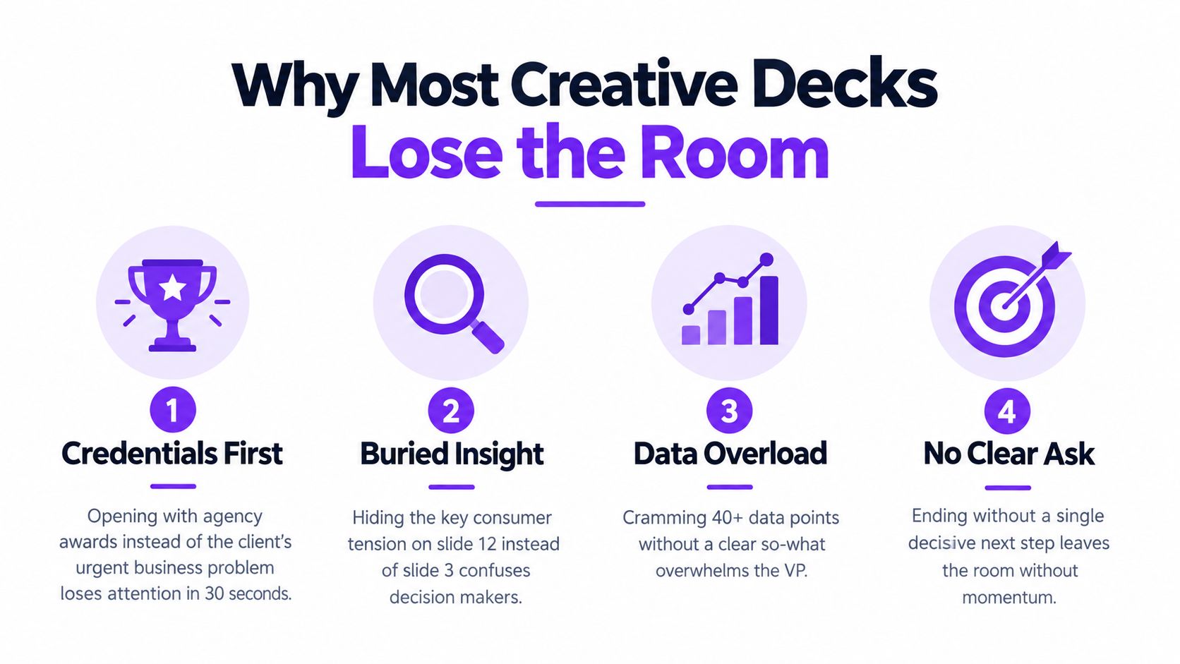
The same source reports that engagement drops by 14% for every 10 minutes a presentation continues beyond the 20-minute mark, and that 79% of people believe most presentations are boring. These findings do not require an arbitrary slide limit. They require each slide to perform a visible job, such as establishing the problem, resolving uncertainty, or supporting a decision.
Storytelling matters here as a form of logic. As noted earlier, it can hold attention beyond a data-only format. In a creative strategy presentation, that means connecting the business problem to an audience truth, a strategic choice, a creative idea, credible proof, and a measurable outcome. The sequence should help the client decide, not merely make the narrative more entertaining.
Use this decision arc:
- Problem: What business change must happen?
- Insight: What audience reality creates an opening?
- Choice: What should the brand own?
- Idea: What creative platform expresses that choice?
- Proof: Why should the client believe it can work?
- Decision: What needs approval now?
A slide that does not advance that arc should be cut, combined, or moved to the appendix. A visually impressive deck still fails if the room cannot tell what choice it is being asked to make, why the choice follows, and how success will be judged.
Building the Strategic Backbone of the Deck
A strong creative strategy presentation makes the strategic logic visible early. The deck should feel less like a research archive and more like a sequence of decisions that the client can follow without guessing.
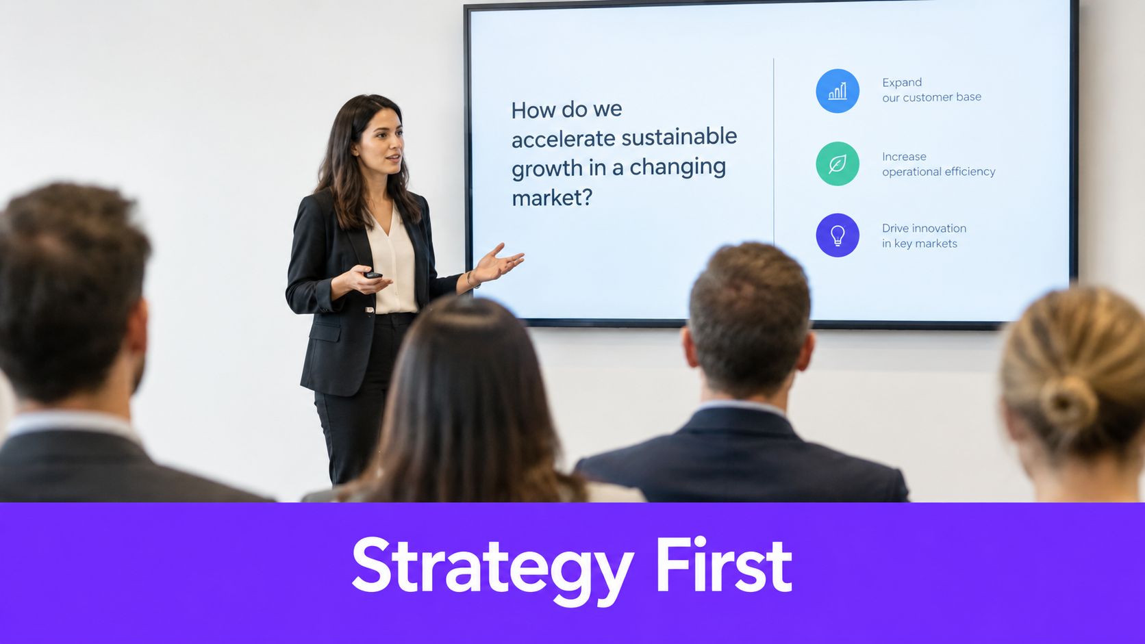
Start with the decision
The title slide should frame a business question, not announce a project. “How can the brand become the first choice for cautious buyers?” gives the room a problem to solve. “Brand relaunch strategy” only labels the file.
Your agenda should be honest about timing and outcomes. Tell the client what they'll understand, what you'll recommend, and what decision you need from them. That creates a contract for the meeting and prevents the deck from feeling like an unbounded presentation.
The market and audience section should prove relevance with selected evidence. Use the category pattern, customer language, and competitive behavior that directly support your diagnosis. Each slide needs a conclusion-led headline, such as “Buyers compare reassurance, not features, at the point of risk.” The supporting evidence should make that sentence credible, while your narration explains its implication.
A strategic tension slide then defines the space the brand can own. It might show the gap between what customers want to feel and what category messages currently promise. Keep the tension human and commercially useful. “Customers want confidence without feeling managed” is more actionable than a broad statement about changing expectations.
Lock the brief before showing the work
The creative brief summary should reduce the strategy to one sentence. Include the objective, audience, insight, proposition, channels, and success measure, but don't turn the slide into a paragraph. A compact structure gives stakeholders something to approve before they judge the creative treatment.
This sequence follows the broader framework recommended in Monday's creative strategy guidance, which moves from market and audience analysis to objectives, big idea, creative brief, stakeholder alignment, asset production, testing, and measurement.
For teams building the process itself, this creative strategy process guide can help translate the sequence into repeatable working steps. Brand consistency also matters at this stage. If multiple people are presenting or developing the deck, guidance on how to maintain brand voice with Taja AI can help keep the language coherent without flattening individual expertise.
A strategic slide should set up one creative direction, not several unrelated possibilities. When the audience understands the problem, tension, and brand choice, the reveal feels earned. The idea can still surprise them, but it shouldn't feel disconnected from the evidence that came before.
A short visual or motion example can clarify how this transition works when the deck needs more than static slides.
The handoff is the important part. End the strategy with a sentence that naturally completes itself in the big idea. If the creative team has to explain why the concept belongs, the backbone hasn't done enough work.
Designing the Big Idea and Proof Slides
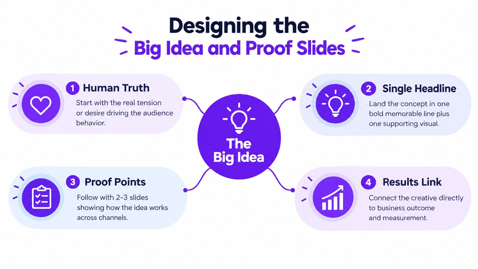
The big idea slide is where many teams overdesign. They present a campaign ecosystem, several routes, channel maps, sample headlines, and a production treatment before the audience has understood the central thought.
Use one headline and one supporting visual. The headline should express the concept in a way the client can repeat after the meeting. The visual should make the idea tangible, not decorate the slide.
A useful reveal has three parts:
- Human truth: Name the tension or desire that makes the audience receptive.
- Brand promise: Explain the role the brand can credibly play.
- Campaign line: Give the creative idea a memorable expression that can travel across executions.
For example, the logic might move from an audience that wants control without more complexity, to a brand promise of making difficult work feel manageable, to a campaign line that dramatizes that relief. The exact wording depends on the brief. The sequence makes the concept easier to evaluate.
Build a credibility arc
Proof slides should answer the objections a skeptical stakeholder is likely to raise. Don't present evidence because you have it. Present it because it resolves a specific doubt.
A useful sequence might include:
- Category evidence: Why this territory matters to the audience.
- Cultural or analogous evidence: Why people already understand or respond to the behavior behind the idea.
- Competitive contrast: Why this approach gives the brand a distinct role.
- Execution logic: How the idea can adapt across the required channels.
- Measurement link: Which outcome will tell the team whether the strategy is working.
Name each slide after its conclusion. “Why emotional storytelling beats feature lists in B2B” gives the audience a point of view. “B2B messaging research” makes them do the work.
Keep each slide to a single argument, and design it for scanning. A client shouldn't need the presenter's voice to understand the headline, evidence, and implication. The presenter adds judgment and context, not basic translation.
Teams that need more support with sequence and slide logic can use this PowerPoint presentation outline as a practical planning reference. The outline should serve the argument, not become a template that dictates the argument.
The final proof slide must connect the creative choice to the business outcome. Don't promise an outcome the evidence can't support. Define the expected behavior, the leading indicator, the review cadence, and what the team will change if the signal is weak.
A credible idea doesn't avoid scrutiny. It makes the scrutiny easier by showing exactly what would prove or disprove the recommendation.
Running Ideation That Strengthens the Strategy
A weak deck often begins with a weak process. One early brainstorm produces a familiar idea, the team starts designing around it, and every later discussion becomes a defense of work that was never properly tested.
Start before the strategy is locked. Define the challenge as a question that invites alternatives, such as “How might the brand make a difficult decision feel easier without sounding simplistic?” Bring in people who know different parts of the problem, including account, creative, strategy, product, sales, or customer teams.
Keep generation separate from evaluation. During the divergent phase, ask for volume and distance from the obvious. Prompts such as “How would a challenger brand attack this category?” or “What would the audience do if the brand disappeared tomorrow?” can break habitual framing.
Use a visible selection method
Once the team has generated ideas, switch modes. Score concepts against originality, strategic fit, and feasibility. The matrix doesn't replace judgment, but it makes judgment discussable. An idea that feels exciting but can't connect to the audience truth should not survive because the most senior person likes it.
Group work has predictable weaknesses. Research summarized by The Conference Board's collaboration review identifies social loafing, evaluation apprehension, regression to the mean, and production blocking as common barriers. It also reports that idea output plateaus when groups grow beyond about six or seven people.
That has practical consequences. Keep the working group small, structure turn-taking, and let people write ideas independently before discussion begins. Separate critique from generation so the first skeptical reaction doesn't narrow the entire room.
A red-team pass is useful before the deck reaches the client. Ask two people to argue against the preferred idea in writing or on camera. Test whether the concept can survive questions about differentiation, brand fit, channel behavior, production demands, and measurement.
For fast visual exploration, a tool such as ShortGenius AI ad creative tool can help teams create early concept directions before committing to polished production. It should widen the option set, not decide which idea is strategically correct. Teams can also use a structured marketing brainstorming session to document prompts, contributors, decisions, and rejected routes.
Write down why you killed the alternatives. When a stakeholder later asks, “Why not the safer route?”, you can answer with criteria rather than taste.
Delivering the Presentation and Closing the Room
A good deck can still fail through poor delivery. Treat the meeting like a stage production, but keep the performance invisible. The audience should notice the argument, not the machinery behind it.
Before the meeting, confirm who will attend, who owns the decision, and which people can block approval later. Set the time available for each section, then remove material that doesn't fit. Arrive early enough to test the projector, sound, links, aspect ratio, and room layout.
Open with the business question. Don't begin with agency history, team introductions, or a tour of the agenda that takes longer than the problem deserves. Narrate the slide instead of reading it, and use the headline as the point you want the room to retain.
The big idea needs space. After the reveal, pause for five seconds. That silence feels long to the presenter and short to the audience. It gives the client a chance to form a reaction before the team fills the room with justification.
Read the signals
Buying signals include questions about market application, implementation, ownership, and timing. Warning signs include requests to receive the deck without discussion or questions that focus only on changing colors and wording. Adjust in real time, but don't abandon the strategic spine because one person wants to skip ahead.
Pre-script answers to the hardest objections:
- Commercial concern: What outcome should this influence, and how will the team review it?
- Brand concern: Which existing brand principle makes this credible?
- Execution concern: What remains consistent across channels, and what changes by format?
Close with a clear ask. State the budget range, timeline, required approvers, and next decision point. “What do you think?” invites vague feedback. “Can we approve the strategic direction today, assign legal and product reviewers, and schedule the asset test?” creates movement.
Within 24 hours, send the promised follow-up, as recommended in the brief. Keep it concise and useful. Link control also matters when multiple files, references, or versions circulate. A guide to the features of URL management tools can help teams maintain cleaner access to shared resources and reduce confusion around outdated destinations.
| Phase | Deliverable | Purpose |
|---|---|---|
| Pre-meeting | Final deck and one-page brief | Align presenters around the thesis and decision |
| Pre-meeting | Objection list and evidence notes | Prepare answers without improvising under pressure |
| Post-meeting | Recap email | Confirm decisions, owners, and open questions |
| Post-meeting | PDF deck and FAQ | Give absent stakeholders a consistent reference |
| Post-meeting | Measurement outline | Preserve the link between creative choice and outcome |
For teams that want a more interactive presentation experience, interactivity in PowerPoint can support navigation and participation. Use it selectively. Interactive elements should help the client inspect a decision, not turn the meeting into a product demonstration.
Mistakes That Sink a Creative Strategy Presentation
Strong creative work often loses because the deck asks the client to make too many connections alone.
Leading with aesthetics makes the work look finished before the business reason is clear. The room may compliment the design while avoiding the decision. Correct it by placing the commercial problem and audience tension before the visual treatment.
Burying the insight under jargon produces polite faces and shallow questions. If stakeholders repeat your language but can't describe the customer tension, rewrite the insight in ordinary words and show the evidence that makes it true.
Over-explaining the brief while under-revealing the solution creates a strange imbalance. The team spends time proving that it understands the assignment, then rushes through the idea. Compress familiar context and protect time for the recommendation, proof, and decision.
Presenting too many ideas without a recommendation transfers the strategic burden to the client. A route comparison can be useful during development, but the final creative strategy presentation should explain which direction you recommend and what makes the others less suitable.
Skipping the measurable outcome leaves finance, product, and senior marketing stakeholders with no way to judge the investment. Define the behavior the strategy should change, the metric that indicates progress, and the review cadence. The idea validation process can help teams pressure-test concepts before they become expensive slides or assets.
Run the final self-audit
Before presenting, ask:
- Thesis: Can someone state the business problem and recommendation after a quick scan?
- Context: Does the research support the choice, or is it delaying the reveal?
- Recommendation: Have we clearly named the direction we want approved?
- Defensibility: Can we explain why this idea fits the audience, brand, and objective?
- Measurement: Is the expected outcome visible before production begins?
- Objections: Have we prepared concise answers for finance, product, legal, and client leadership?
- Ask: Does the final slide specify the decision, owner, timing, and next action?
Strategy presentation mistakes are usually architectural, not cosmetic. Restyling a crowded deck won't make the recommendation clearer. Rebuild the decision arc, remove defensive material, and make every proof point serve the choice.
Bulby helps marketing agencies, creative teams, ad agencies, and brand strategists run structured brainstorming sessions, bring more voices into ideation, and turn scattered input into focused ideas and next steps. Use Bulby before the deck is designed to pressure-test concepts, reduce predictable group bias, and give the final creative strategy presentation a stronger foundation.