
The Essential Foundations of Supply and Demand Curves

Supply and demand curves are fundamental to understanding economics. These graphs visualize the relationship between a product's price and the quantity supplied or demanded. For a deeper dive into practical application, check out this article on trading supply and demand zones. Let's explore the underlying principles behind these curves.
Understanding Supply Curves
Supply curves typically slope upwards. This upward slope reflects the law of supply: as a product's price increases, producers are willing to supply more. This makes sense – higher prices mean greater potential profit, incentivizing increased production.
For example, imagine the price of coffee beans doubles. Farmers would likely allocate more resources, like land and labor, to coffee production to capitalize on the higher price.
Understanding Demand Curves
Demand curves generally slope downwards. This illustrates the law of demand: as a product's price increases, consumers are willing to buy less. This aligns with typical consumer behavior – higher prices encourage consumers to find cheaper alternatives or reduce consumption.
Think about your favorite streaming service. If the price jumped significantly, you might cancel your subscription or share it with others to lower the cost.
Elasticity of Supply and Demand
Elasticity is another important concept. It describes how sensitive demand is to price changes. Goods can be inelastic or elastic.
- Inelastic goods: Demand remains relatively stable even with price fluctuations. Energy is a good example. People need it daily, and reducing consumption, even with price hikes, is difficult.
- Elastic goods: Demand changes significantly with price adjustments. Luxury items, like steak, are elastic. Consumers easily switch to cheaper alternatives like chicken or pork if steak prices rise.
Energy's demand elasticity typically ranges from -0.1 to -0.3, demonstrating its inelastic nature. This highlights how different products and markets respond to shifts in supply and demand. You can learn more about supply and demand. For more on brainstorming and organizing your thoughts, you might find this helpful: How to master brainstorming with graphic organizers.
From Data to Visual: Creating Powerful Economic Graphs
Building on supply and demand basics, let's explore how to graph these economic forces. Visualizing this data through graphs helps us understand market dynamics. This section provides a step-by-step guide to creating accurate and insightful supply and demand graphs.
Setting Up Your Graph
First, label the axes correctly. Price goes on the vertical (y) axis, and quantity goes on the horizontal (x) axis. This standard orientation ensures consistent interpretation across economic analyses. It's like laying the foundation before building a house.
Next, enter the data points. These points represent specific price-quantity combinations from market research or economic models. Accurate plotting is essential for representing the market relationship between price and quantity.
Finally, connect the data points to form the curves. The upward-sloping supply curve shows how producers react to price changes. Conversely, the downward-sloping demand curve visually represents consumer behavior in response to price changes.
Common Graphing Pitfalls and Best Practices
One common mistake is mislabeling the axes. This seemingly small error can lead to significant misinterpretations of market dynamics. Another issue is using inconsistent scales on the axes, which can distort the visual representation of the market. For instance, a compressed price axis can make curves appear flatter.
To avoid these errors, double-check your axis labels and select appropriate scales. This ensures your graphs accurately reflect market conditions, much like using accurate measuring tools in baking.
To better illustrate the key differences and similarities between the supply and demand curves, let's look at a comparison table.
To better understand the relationship between supply and demand curves, we can refer to the following table. This table highlights the key characteristics of each curve, allowing for a clear comparison.
| Characteristic | Supply Curve | Demand Curve |
|---|---|---|
| Slope | Upward | Downward |
| Relationship with Price | Direct (as price increases, quantity supplied increases) | Inverse (as price increases, quantity demanded decreases) |
| Reflects Behavior of | Producers | Consumers |
| Affected by factors such as | Production costs, technology | Consumer income, tastes, preferences |
As this table clearly illustrates, the supply and demand curves have opposite reactions to changes in price. Understanding these core differences is vital for correctly interpreting market dynamics.
Using Graphs to Understand Market Relationships
Economists and business analysts use these graphs to explain complex market dynamics. Graphs effectively communicate important economic information visually. Anyone can gain deeper market insights and make better decisions by understanding how to graph supply and demand. These graphs are like a map, guiding us through the complexities of the marketplace.
Digital Tools for Graphing
Digital tools, such as Microsoft Excel or Google Sheets, can significantly streamline the graphing process. These tools automatically plot data and generate curves, simplifying the process and reducing manual errors. However, understanding underlying economic principles remains crucial for interpreting results. These tools are like power tools; they enhance your abilities, but you still need to know how to use them effectively.
Decoding Market Equilibrium: Where Supply Meets Demand

The intersection of supply and demand curves helps us understand more than just price. It reveals the market equilibrium, a crucial concept in economics. This point represents a balance where the quantity buyers desire matches the quantity sellers are willing to offer. Let's explore how to find and understand this important point on a graph.
Identifying the Equilibrium Point
The equilibrium point is located where the supply and demand curves intersect. This intersection signifies a state of balance in the market. The price at this intersection is called the equilibrium price, and the corresponding quantity is known as the equilibrium quantity.
For instance, if the curves intersect at a price of $10 and a quantity of 100 units, this tells us that at a price of $10, both buyers and sellers agree on a quantity of 100 units.
Understanding Market Imbalance: Surplus and Shortage
Markets don't always function perfectly at equilibrium. Sometimes, prices fluctuate above or below the equilibrium point, creating a market imbalance. This imbalance can take the form of a surplus or a shortage.
-
Surplus: A surplus arises when the market price exceeds the equilibrium price. At this higher price, sellers are motivated to produce more than buyers actually want. This excess supply then puts downward pressure on the price as sellers compete with each other. Think of stores discounting excess inventory to clear out shelves.
-
Shortage: A shortage develops when the market price falls below the equilibrium price. At this lower price, buyer demand surpasses the quantity sellers are offering. This limited supply pushes prices upward as buyers compete for the scarce goods. A common example is concert tickets selling out rapidly and then being resold at inflated prices on the secondary market.
The Market's Tendency Toward Equilibrium
Market forces generally work to restore equilibrium. If a surplus occurs, decreasing prices encourage more buying and less selling, eventually leading back to a balance. Conversely, if a shortage exists, increasing prices motivate more selling and less buying, again moving the market toward equilibrium.
One recent illustration of supply and demand dynamics is the global inflation following the pandemic. As economies recovered, demand for goods and services surged, effectively shifting demand curves outward. Combined with pandemic-related supply chain disruptions, this resulted in higher prices and quantities. In the US, core inflation increased significantly in 2022, with the CPI rising by approximately 5.4% compared to the previous year. This highlights the impact of supply and demand imbalances on inflation. For more detailed statistics, check out this resource: Supply and Demand Drivers of Global Inflation Trends. Understanding these market dynamics is crucial for businesses and policymakers alike. Analyzing graph supply and demand curves offers valuable insights for anticipating market behavior and making informed decisions.
Mastering Curve Shifts: Beyond Simple Price Changes
Understanding how supply and demand curves work is a powerful tool for market analysis. But the real power comes from understanding why these curves shift. This section explores the difference between movements along the curves (caused by price changes) and shifts of the entire curve (caused by other market factors).
The following infographic shows the basic intersection of supply and demand, highlighting the equilibrium point.
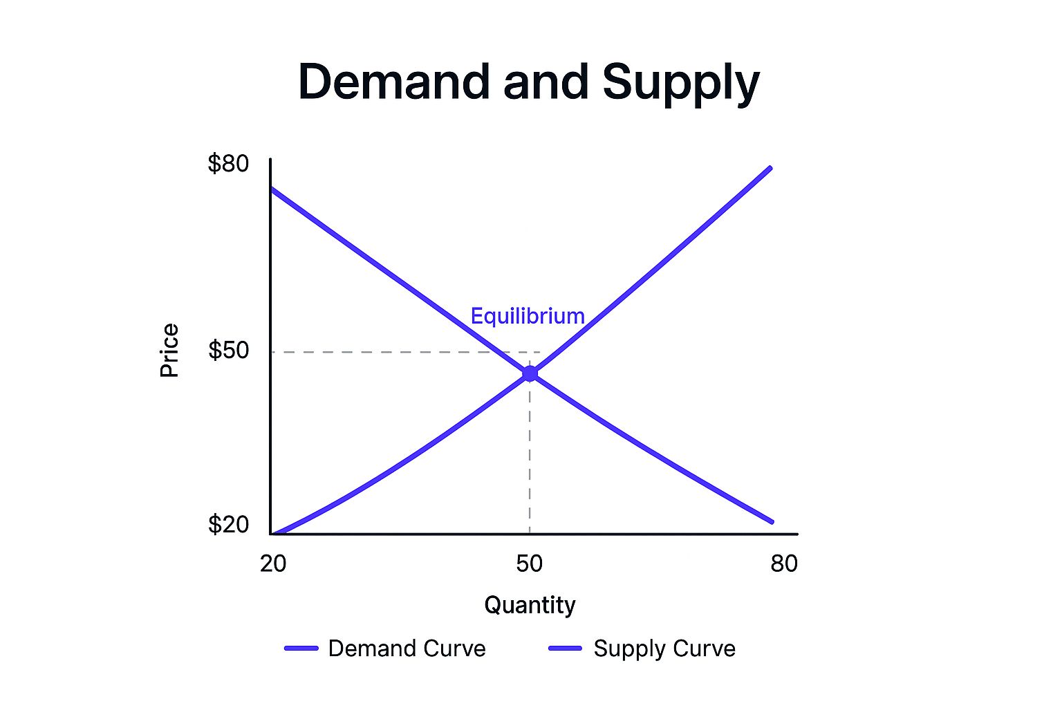
This graph shows the relationship between price and quantity for both supply and demand. The intersection represents the market equilibrium. The equilibrium occurs where the supply and demand curves meet—in this case, at a price of $50 and a quantity of 50 units. Understanding market equilibrium is key for figuring out where supply meets market demand.
Factors That Shift Demand Curves
Several factors can cause the entire demand curve to shift. A shift in demand means that at any price, consumers are willing to buy a different quantity than before.
-
Changes in Consumer Preferences: If tastes shift toward a product (like plant-based meats becoming more popular), the demand curve shifts to the right. This shows higher demand at every price. If tastes shift away (like declining soda consumption), the curve shifts left.
-
Changes in Income: As consumer income rises, demand for normal goods usually increases (shifting the curve right). But for inferior goods (like budget-friendly items), demand may decrease as income rises (shifting the curve left).
-
Prices of Related Goods: Changes in the prices of substitute goods (like tea vs. coffee) or complementary goods (like printers and ink) can affect demand. If a substitute's price drops, demand for the original good might decrease (leftward shift). If a complement's price drops, demand for the original good might increase (rightward shift).
-
Consumer Expectations: If people expect higher prices in the future, they may buy more now (rightward shift). Expecting lower prices might cause them to delay purchases (leftward shift).
Factors That Shift Supply Curves
Supply curves can also shift. This indicates changes in producers' willingness to supply goods at every price.
-
Changes in Input Prices: Higher costs for raw materials, labor, or other inputs shift the supply curve left, meaning fewer goods offered at each price. Lower input prices shift the curve right.
-
Technological Advances: Improvements in production efficiency often shift the supply curve to the right, allowing more goods at lower costs.
-
Government Policies: Taxes, subsidies, and regulations can affect supply. Taxes often shift the curve left (less production), while subsidies can shift it right (more production).
-
Number of Sellers: More producers entering a market shifts the supply curve right (more supply). Businesses leaving shift it left (less supply).
To better understand these shifts, let's examine a table summarizing the factors influencing supply and demand:
Factors Causing Shifts in Supply and Demand Curves
A detailed breakdown of the various factors that cause supply and demand curves to shift, along with their effects on market equilibrium.
| Factor | Affects | Direction of Shift | Effect on Equilibrium |
|---|---|---|---|
| Consumer Preferences | Demand | Right (increased preference), Left (decreased preference) | Changes equilibrium price and quantity |
| Income | Demand | Right (normal goods), Left (inferior goods) | Changes equilibrium price and quantity |
| Price of Substitute Goods | Demand | Left (substitute price decrease), Right (substitute price increase) | Changes equilibrium price and quantity |
| Price of Complementary Goods | Demand | Right (complement price decrease), Left (complement price increase) | Changes equilibrium price and quantity |
| Consumer Expectations | Demand | Right (expectation of higher future prices), Left (expectation of lower future prices) | Changes equilibrium price and quantity |
| Input Prices | Supply | Left (increased input prices), Right (decreased input prices) | Changes equilibrium price and quantity |
| Technological Advances | Supply | Right (improved technology) | Changes equilibrium price and quantity |
| Government Policies (Taxes/Subsidies) | Supply | Left (increased taxes), Right (increased subsidies) | Changes equilibrium price and quantity |
| Number of Sellers | Supply | Right (more sellers), Left (fewer sellers) | Changes equilibrium price and quantity |
This table summarizes the various factors that can lead to shifts in either the supply or demand curve, ultimately affecting the market equilibrium point. These shifts reflect real-world changes in consumer behavior and producer decisions.
Analyzing graph supply and demand curves involves more than simply finding the current equilibrium. By understanding the factors that can shift these curves, you gain valuable insights into how future market changes—like evolving consumer needs or new technologies—will affect prices and quantities. This understanding is important for effective business strategies and smart investment choices.
Supply and Demand Graphs in Action: Real-World Applications
Supply and demand graphs are more than just theoretical concepts. They're practical tools used to make important decisions in businesses and policy worldwide. Let's explore how these graphs provide valuable, actionable insights.
How Businesses Use Supply and Demand Graphs
Businesses in various sectors use supply and demand analysis to inform their strategies. For instance, housing developers analyze the local housing market to figure out the best time to start new projects. By looking at the current supply of homes and the demand from potential buyers, they can pinpoint periods of high demand and low supply. This helps maximize their chances of a successful project.
Commodity traders also rely on these graphs. They use them to predict price fluctuations by monitoring changes in supply (like weather affecting crops) and demand shifts. This allows them to anticipate price movements and make smart trading decisions.
Tech companies use supply and demand analysis, especially when pricing new products or services. By modeling various price points and gauging potential customer demand, they can find the best pricing strategy to boost revenue.
Predicting Market Disruptions with Supply and Demand Analysis
Supply and demand analysis can even predict big market changes. The rise of streaming services is a great example. As more people switched from cable TV to on-demand streaming, the demand for streaming subscriptions increased while cable subscriptions declined. This shift was clear in the changing demand curves, providing an early sign of the entertainment industry's transformation. You might be interested in: Creative Thinking Exercises for Teams.
Another example is the growing use of renewable energy. With increasing concern about climate change and energy security, the demand for solar and wind power has surged. At the same time, advances in renewable energy technology have boosted supply and lowered costs. These changes, visible in the supply and demand curves, show the ongoing shift in the energy sector.
The Role of Supply and Demand in International Markets
Supply and demand principles also apply to international trade and currency markets. The foreign exchange market is a good illustration. When demand for a currency like the U.S. dollar is high, and the supply is limited, its value generally increases compared to other currencies. On the other hand, a surplus of dollars and low demand will typically cause the dollar's value to fall. This occurred during the COVID-19 pandemic when global uncertainty increased demand for "safe-haven" currencies like the U.S. dollar, causing its value to rise. Understanding these trends is essential for businesses and investors involved in global trade. Learn more about supply and demand curves in foreign exchange.
Bridging Theory and Practice
Understanding graph supply and demand curves isn't just about theoretical knowledge. It's about the ability to interpret market activity, anticipate changes, and make informed decisions. Whether you're a business owner, an investor, or just curious about the world, understanding these principles is a valuable skill. Learning how to use these tools can give you a real advantage.
Advanced Graphing Techniques for Complex Market Analysis
This section expands on basic supply and demand curve graphing and explores more advanced techniques used by professional analysts. These techniques provide a deeper understanding of complex market situations.
Visualizing Interconnected Markets
Markets are often interconnected. Changes in one can trigger changes in others. For instance, higher gasoline prices might increase demand for fuel-efficient vehicles. To visualize these relationships, analysts use multiple graphs. One might show the gasoline market, another the car market. Linking these visuals helps show how changes in one influence the other, offering a more complete picture of broader economic impacts.
Graphing Policy Interventions: Taxes and Subsidies
Governments often use taxes and subsidies to influence markets. These interventions directly impact supply and demand curves. A tax increases production costs, shifting the supply curve left. This usually leads to a higher equilibrium price and a lower equilibrium quantity. A subsidy, however, reduces production costs, shifting the supply curve right. This results in a lower equilibrium price and a higher equilibrium quantity. Graphing these policies helps visualize their effects.
Illustrating Price Controls
Price controls, like price ceilings and price floors, also have significant market impacts. A price ceiling sets a maximum legal price, while a price floor sets a minimum. A price ceiling below the equilibrium price creates a shortage, shown graphically as a gap between quantity demanded and quantity supplied at the ceiling price. A price floor above the equilibrium creates a surplus, visualized as a gap between supply and demand at the floor price. Graphs clearly demonstrate the consequences of these policies.
Incorporating Consumer and Producer Surplus
Consumer surplus is the difference between what consumers are willing to pay and what they actually pay. Producer surplus is the difference between what producers receive and the minimum they'll accept. These are shown on supply and demand graphs by shading specific areas. Consumer surplus is the area below the demand curve and above the market price. Producer surplus is the area above the supply curve and below the market price. Visualizing these surpluses helps understand market efficiency and welfare implications. Read also: How to master design thinking with our guide.
Digital Tools for Complex Modeling
Specialized software and digital tools offer advantages for complex analysis. These tools manage large datasets and complex calculations needed for modeling interconnected markets or advanced economic scenarios. While these tools streamline the process, a strong understanding of economic principles is still essential.
By mastering these advanced techniques, analysts gain a more nuanced understanding of market dynamics and improve their ability to predict outcomes. These skills are valuable in consulting, financial analysis, and strategic planning.
Ready to supercharge your team's brainstorming sessions? Check out Bulby.