
A conference booth is busy, your team is handing out flyers, and most visitors are already thinking about the next session. A handout that only repeats your headline may never get a second look. A better one gives people a reason to keep it, interact with it, or take a clear next step after they leave.
Start with the behavior you want: plant it, play it, scan it, collect it, or use it. Then choose a format that makes that action easy and fits your audience, budget, and distribution setting. Useful, reusable promotional products can remain visible after the original event, while a tracked response path helps your team learn what prompted action. For print choices and personal formats, see this Power Print personal card guide.
These campaign handout ideas are built around participation, memory, and conversion. Each one includes a practical use case, production considerations, limitations, and a way to connect the handout to your campaign goal.
Table of Contents
- 1. Seed Paper Handouts
- 2. Scratch-Off and Game-Piece Handouts
- 3. Sample Sachets and Trial Kits
- 4. Zine-Style Mini Booklets
- 5. Pop-Up and Paper-Engineered Handouts
- 6. Fold-and-Play Activity Handouts
- 7. Cardboard Viewer and Print-to-Experience Handouts
- 8. Collectible Trading Card Handouts
- 8 Campaign Handout Ideas Compared
- Choose the Behavior Before Choosing the Format
1. Seed Paper Handouts
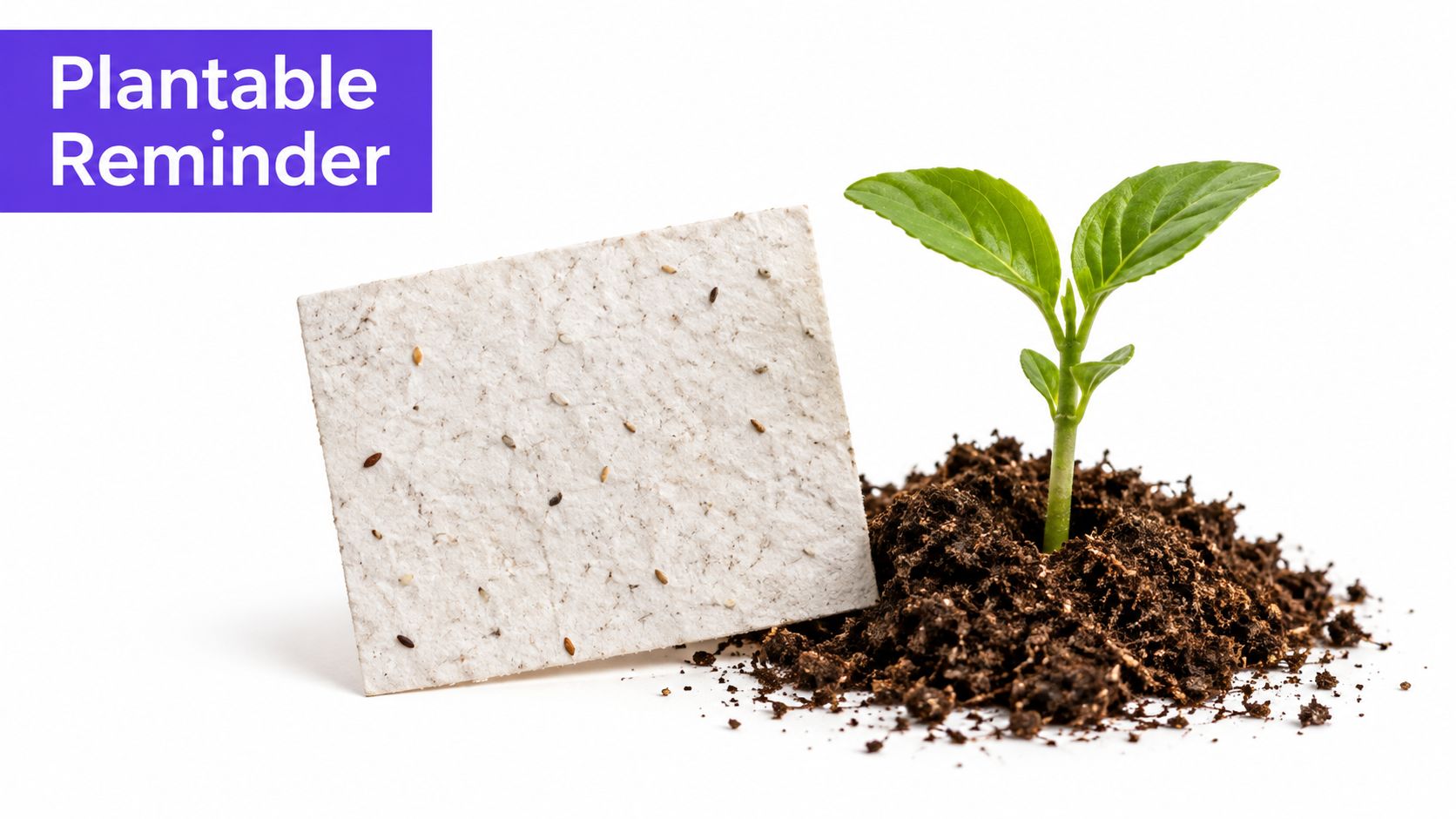
Seed paper gives a printed message a second life. The paper contains wildflower or herb seeds, so recipients can plant it after reading. That makes it a natural fit for sustainability-focused campaigns, earth-related events, and brands that want a more memorable alternative to a disposable flyer.
A seed-paper reminder card can carry a concise campaign message, planting directions, and a simple follow-up action. A sustainability organization might include a short URL for local volunteer information, while a garden brand could use a QR code to direct recipients to planting advice. If you're brainstorming related creative routes, explore these campaign ad ideas and adapt a concept to the handout itself.
Make planting part of the message
Keep the print area simple. Choose plant-safe, water-based inks, and ask your supplier about germination testing before approving a large run. Clear instructions matter too: specify how to prepare and plant the paper, and make sure the advice matches the seed variety and recipient's location.
The main limitation is that planting requires the right conditions and some effort. Don't promise a successful bloom, and don't make environmental claims you can't support. Confirm what the paper, seeds, and manufacturing process contain before describing the handout as sustainable.
Production rule: Treat the planting instructions as essential content, not fine print. A recipient should understand what to do without needing to scan a code.
Use a hashtag or QR code as an optional next step, not the only call to action. That way, the handout still works for people who don't want to use a phone, and the planted paper can remain a physical reminder of the campaign.
2. Scratch-Off and Game-Piece Handouts
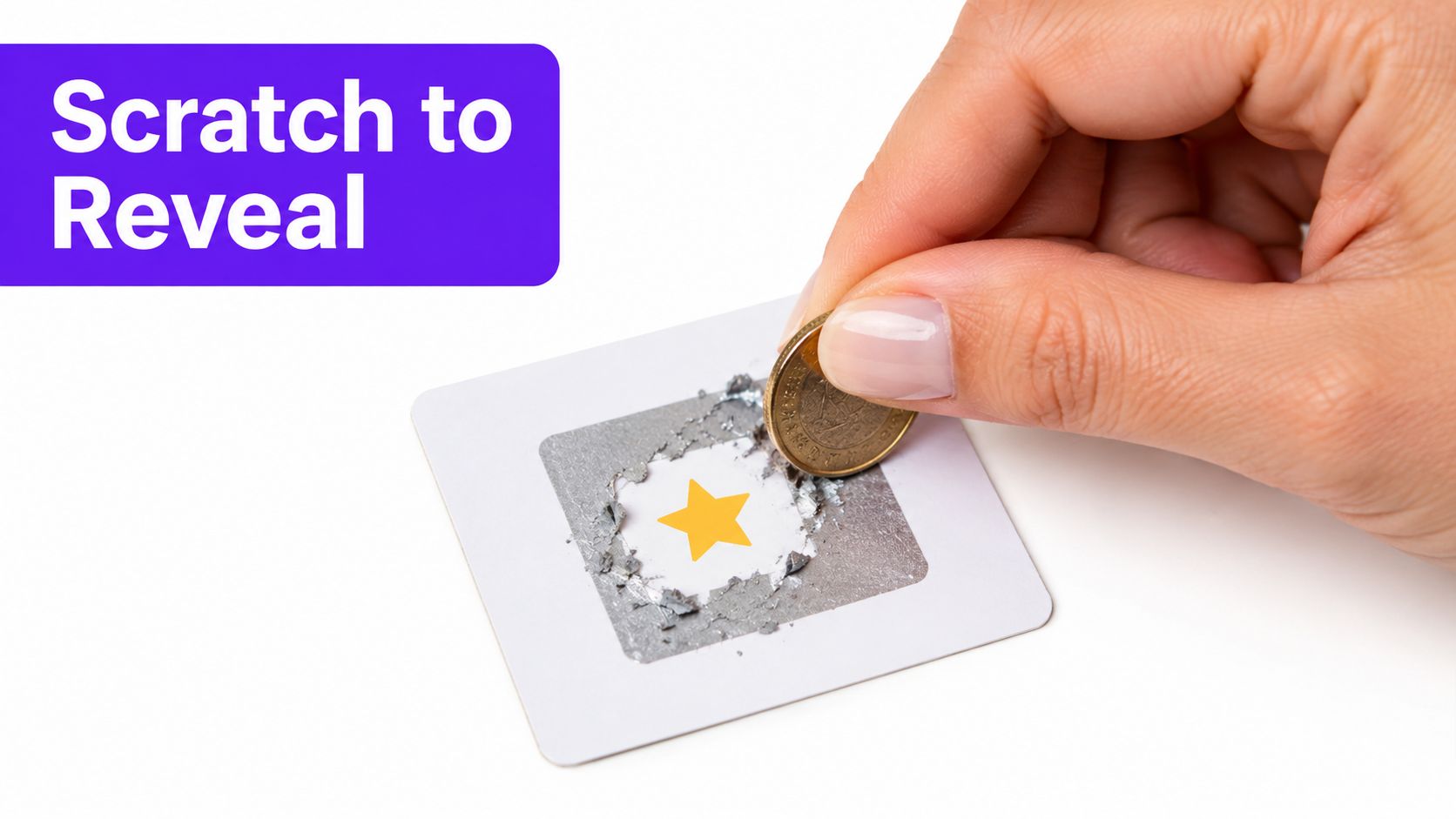
A scratch-off card turns a handout into a small moment of suspense. The recipient reveals an offer, prize, or message, then gets a reason to visit a store, website, or event. It suits retail promotions, restaurant campaigns, and live activations where immediate participation matters.
McDonald's Monopoly is a familiar example of game pieces encouraging repeat visits through a larger collection-and-reward mechanic. A simpler campaign can use scratch-off cards to reveal a discount, a menu item, or an invitation to redeem something at a particular location. Make the reveal meaningful to the audience rather than adding a game layer just for novelty.
Build the rules before the artwork
The mechanic brings legal and operational requirements. Ask legal counsel to review the promotion before printing, especially if the campaign includes prizes, random selection, or a purchase requirement. Put the official terms and eligibility details where recipients can read them, and make sure the handout doesn't imply a guaranteed prize if that isn't how the promotion works.
Use unique, hard-to-copy codes and validate each one in a database. That lets staff confirm redemptions and helps your team distinguish campaign responses from ordinary sales. Set a clear redemption window, but make the expiry date easy to find and understand.
Keep the card's main action simple. A recipient should know what to scratch, what they've won or revealed, and how to claim it. For distributed cards, assign codes by location or audience segment so you can compare response without relying on impressions alone.
The format works best when the reward matches the effort. A confusing redemption process or a prize that feels irrelevant can turn anticipation into frustration. Test the full journey, from reveal to redemption, before the cards reach customers.
3. Sample Sachets and Trial Kits
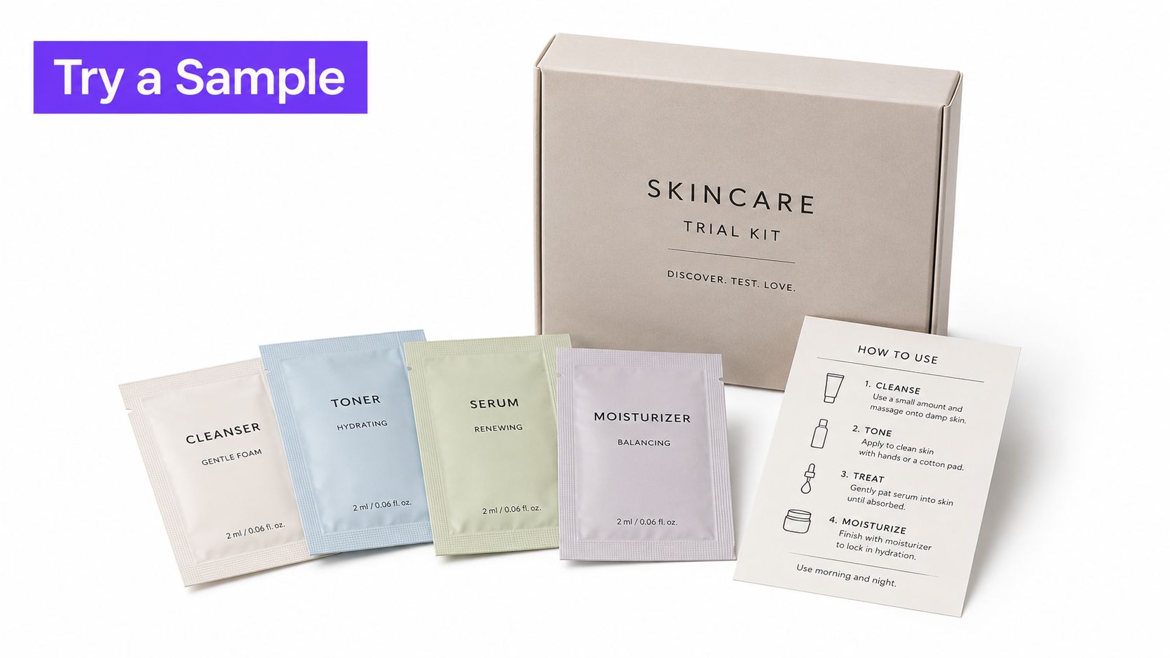
A sample lets someone experience a product before committing to a full-size purchase. That makes sachets and trial kits a strong choice for beauty, food, supplements, and tech accessories, where texture, taste, fit, or ease of use can be more persuasive than a product description.
Birchbox built its subscription proposition around curated beauty samples, illustrating how product discovery can become part of the customer experience. A campaign doesn't need to copy that model. A skincare brand can offer a small routine kit at an event; a food company can pair a sample with a recipe card; an accessories brand can demonstrate a product feature alongside a QR code linking to setup instructions.
Connect trial to a next step
Target samples to people whose interests or prior behavior make the product relevant. A broad giveaway may create unnecessary cost and waste, while a well-matched trial gives the recipient a reason to use the product. Keep packaging easy to carry and clear about ingredients, usage, and any necessary safety information.
Add a time-limited promotion code to the accompanying card, then track how many recipients use it toward a full-size purchase. Make the code readable and easy to enter, and provide a short URL or equivalent route for people who don't want to scan a QR code. For additional inspiration on building the campaign around a product experience, consider these innovative marketing strategies.
Packaging should protect the sample without creating needless bulk. Design the card or sleeve to be useful after the product is gone, perhaps with instructions, a routine, or a product comparison. That gives the handout a purpose beyond carrying the sachet.
Check applicable product labeling, ingredient disclosures, and distribution rules with the relevant internal teams before production. A trial kit can prompt purchase, but it must also help recipients understand what they're using and how to use it responsibly.
4. Zine-Style Mini Booklets
A zine gives a campaign room to tell a story instead of leading with a sales pitch. These small, self-published booklets can share artwork, interviews, tips, or behind-the-scenes material in a deliberately personal style. They're a good fit for niche communities and audiences that respond to cultural relevance and useful content.
Fashion and outdoor brands can use a zine to show how products fit into real creative or practical pursuits. At a music festival, a compact booklet could combine a program with artist notes, community recommendations, or a map. That gives attendees a reason to keep it after they've checked the schedule.
Give the reader something worth keeping
Build the booklet around a clear editorial idea. A zine about local creative work, field notes from a campaign, or a set of practical guides will feel more valuable than several pages of product claims. Invite artists or community contributors to take part when their perspective fits the subject, and agree on permissions and credit before printing.
A small run at a pop-up or event helps your team see which pages people read, keep, or share before committing to a broader distribution. Include a trackable QR code or short URL on the final page, but make the booklet useful without it. The digital action might lead to a playlist, longer interview, event schedule, or product page that continues the story.
Keep legibility in mind. A rough, handmade aesthetic can feel intentional, but text still needs enough contrast and size to be comfortable to read. Provide translated or symbol-supported instructions where relevant, and don't hide essential information in decorative layouts.
Zines work less well when the campaign needs a fast, direct conversion and the audience has no reason to spend time with editorial content. In that situation, a concise offer card may be more appropriate. Choose the booklet when the content itself is part of the value.
5. Pop-Up and Paper-Engineered Handouts
A pop-up handout makes opening the piece part of the experience. Paper engineering can raise an image, reveal a message, or create a small moving structure. The tactile surprise suits product launches, premium campaigns, and brand storytelling where a memorable reveal justifies more involved production.
Techniques associated with paper engineers Robert Sabuda and Matthew Reinhart show how folds and layered construction can transform a flat page into a three-dimensional scene. For a brand, that could mean a pop-up product, a simplified scene tied to an environmental campaign, or a visual metaphor that supports the launch message.
Prototype before committing to a run
Start with a physical prototype, not just a digital mockup. Test whether the structure opens smoothly, stays intact, and folds flat enough for the intended envelope or packaging. If the piece will be mailed, check its durability through the actual packing and handling process. Limit moving parts to keep production manageable.
Plan the message so it still makes sense when the handout is closed. Add a clear, readable panel that explains the campaign and gives the recipient a useful next step, such as a short URL, event invitation, or product detail page. The paper mechanism should support the message rather than obscure it.
A photo-friendly reveal can encourage recipients to share the piece, but don't make social posting the only measure of success. Track direct responses using a campaign-specific code or landing page, and compare the cost of the format with the value of the audience reached.
This production style can be expensive and may not suit mass distribution. It's strongest when sent to a focused audience, presented at a launch, or used to make a central creative idea tangible. For visual direction, browse these campaign design examples.
A pop-up can also fail if the design is too complicated to assemble or too fragile to handle. Ask the printer to test materials, folds, and final packaging early, while there's still time to simplify.
6. Fold-and-Play Activity Handouts
A fold-and-play handout asks the recipient to do something with the paper. It might be a maze, origami shape, puzzle, cootie catcher, or small game. This turns passive reading into participation, making the format useful at schools, family activations, conferences, workshops, and events where people have a reason to interact.
Cereal brands and children's products have long used printed games and activities on packaging and inserts. A conference team can adapt the mechanic for adults with a fold-out puzzle, a set of networking prompts, or a simple activity that introduces a session topic. At a workshop, participants might use the folds to choose a discussion question and start talking.
Make play intuitive
The activity should be easy to understand without a staff member explaining every step. Use clear folding marks and test the sequence with people who haven't seen the design. If the game requires complex instructions, simplify it or include a short visual guide.
For a more purposeful experience, put a question or prompt inside each fold. A brand focused on financial education could use scenario questions; a product team could use prompts that help attendees describe a problem they face. That keeps the activity connected to the campaign instead of making it an unrelated distraction.
A handout earns attention when the action feels natural. Don't make recipients solve the instructions before they can enjoy the activity.
Consider durability and accessibility too. Small text, low contrast, and tiny fold details can make the activity difficult to use. Use legible type, strong contrast, and a non-play alternative for anyone who can't or doesn't want to manipulate the paper.
A fold-and-play piece isn't the best fit for every distribution setting. It takes time and space to use, so it works best when people can pause, take part, and connect the activity to a conversation or follow-up action.
7. Cardboard Viewer and Print-to-Experience Handouts
Print-to-experience handouts use a physical piece to open a digital interaction. A printed card might lead to a product video, interactive page, contest entry, or augmented-reality filter. A cardboard viewer can also pair with a smartphone to present a virtual-reality experience.
Google Cardboard was distributed through The New York Times as part of its virtual-reality storytelling push. For a campaign today, the important principle is the connection between the physical object and the digital content. The viewer or printed card should make that transition clear and worthwhile.
Keep the digital path simple
Label the QR code with a direct explanation of what it opens. Add a short URL as a fallback, and design the landing page for mobile screens and cellular connections. Test the experience on devices used by your target audience, including older phones if they're likely to be in the mix.
Keep the digital content focused. A product demonstration, short interactive story, or event entry should deliver on the handout's promise without making people work through a maze of screens. If you're using an AR effect or VR viewer, provide a plain explanation of the required steps and any device limitations.
Track scans, visits, and meaningful actions such as sign-ups or redemptions. Unique QR codes by creative version, location, or audience segment can help the team see which distribution choices prompted engagement. QR codes can support measurement, but they don't make a campaign accessible by themselves. Include the key information on the handout and offer a non-digital route for the main action.
Use a cardboard viewer only when the digital experience genuinely benefits from it. Otherwise, a well-designed card with a clear link may cost less, travel more easily, and reduce setup friction. For more ways to connect campaign channels, explore these marketing campaign ideas.
8. Collectible Trading Card Handouts
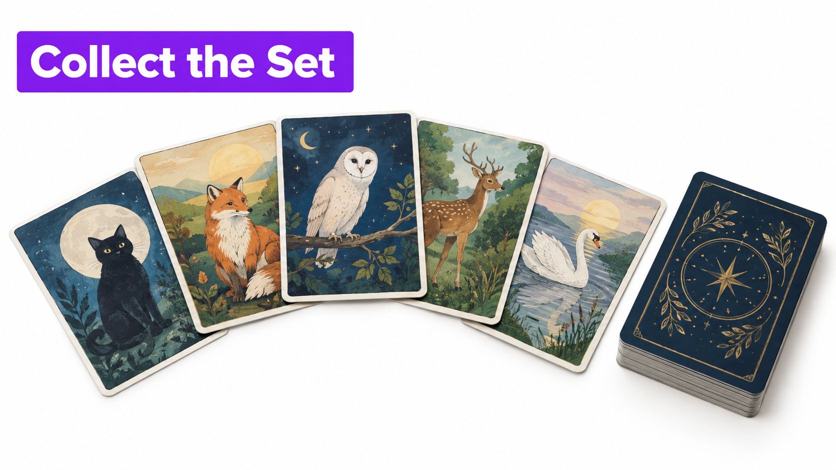
A collectible card gives recipients a reason to keep, trade, and look for more. A series can feature characters, products, locations, or chapters of a campaign story. This works well for entertainment, sports, food, and retail campaigns with an audience that enjoys collecting or sharing themed items.
Topps has produced trading-card sets connected to brands and entertainment properties, and fast-food and cereal promotions have used collectible premiums to encourage repeat engagement. For a campaign, build a complete set around a coherent idea rather than printing disconnected designs. Each card should stand on its own while contributing to the larger collection.
Plan supply and access fairly
Decide the collection goal before printing. Show recipients how many cards make up the set, where they can get them, and whether any cards are available through a particular channel. A digital code can provide a bonus illustration, story, or printable card, but the collection should still work for people who don't have a smartphone.
A mix of widely available cards and special designs can add variety, but avoid a distribution plan that makes the basic set impossible to complete. State any limits clearly and make sure staff know how to answer questions about availability. If the cards connect to purchases or prizes, have the promotion reviewed for relevant legal and consumer-protection requirements.
Track redemption or collection activity with unique codes, campaign-specific links, or simple event tallies. You can also invite recipients to trade cards at a designated booth or community event, giving the physical pieces a social role beyond the original handout. For ideas that extend the collection into social sharing, see these social media campaign ideas.
The limitation is that collecting only works when people care about the theme and can access the pieces fairly. Don't use scarcity as a substitute for a strong concept. Make the cards worth keeping through illustration, useful information, or a story recipients want to complete.
8 Campaign Handout Ideas Compared
| Handout Type | 🔄 Implementation Complexity | ⚡ Resource Requirements | 📊 Expected Outcomes | ⭐ Key Advantage | 💡 Ideal Use Cases |
|---|---|---|---|---|---|
| Seed Paper Handouts | Moderate; requires print and germination checks | Higher unit cost; plant-safe inks and seed paper | Memorable, shareable sustainability touchpoint | Reinforces an eco-conscious brand message | Sustainability campaigns, earth-focused events, eco-friendly brands |
| Scratch-Off and Game-Piece Handouts | Moderate to high; rules, secure codes, and legal review needed | Printing, prize budget, and redemption tracking | Immediate engagement, visits, and measurable redemptions | Combines anticipation with trackable response | Retail promotions, restaurants, experiential events |
| Sample Sachets and Trial Kits | High; sourcing, targeting, and fulfillment coordination | Product samples, packaging, shipping, and logistics | Product trial and potential first-purchase conversion | Lets recipients experience the product directly | Beauty, food, supplements, consumer products |
| Zine-Style Mini Booklets | Low to moderate; requires clear editorial direction | Low-to-moderate print and creative costs | Longer reading time, sharing, and brand storytelling | Can feel authentic and culturally credible | Niche audiences, pop-ups, festivals, community campaigns |
| Pop-Up and Paper-Engineered Handouts | High; specialist design, prototyping, and production | High production costs; durable stock and protective mailing | Strong visual impact, sharing, and product recall | Creates a premium, tactile reveal | Product launches, premium mailers, brand storytelling |
| Fold-and-Play Activity Handouts | Low to moderate; folding and instructions need testing | Low-cost printing; simple design and distribution | Active participation and increased time with the brand | Turns a handout into an interactive activity | Schools, family events, conferences, workshops |
| Cardboard Viewer and Print-to-Experience Handouts | Moderate to high; digital content and device testing required | Printed materials, mobile content, and analytics setup | Digital engagement measurable through scans or visits | Connects physical print with interactive content | VR/AR campaigns, product demos, video or web activations |
| Collectible Trading Card Handouts | Moderate; requires series planning and distribution control | Card printing, full-set design, and inventory planning | Repeat engagement, trading, and collection interest | Encourages repeated interaction and community exchange | Fan campaigns, entertainment promotions, retail or event giveaways |
Choose the Behavior Before Choosing the Format
The best campaign handout ideas start with the action you want a recipient to take. Decide whether the campaign needs people to remember a message, play, try a product, scan, collect, or continue an experience. Then choose the simplest format that makes that behavior feel worthwhile.
Match the format to the audience and the setting. Seed paper suits a campaign where planting reinforces the message. A sample kit makes sense when firsthand use helps explain the product. A zine can carry a story, while a game piece encourages immediate participation. A pop-up handout earns its place when a crafted reveal supports a premium launch, and a collectible card fits an audience with a reason to complete a series.
Budget should follow distribution strategy, not just visual ambition. A highly produced piece sent to a broad, poorly qualified audience can waste money. A simpler handout, targeted to people who have a clear reason to engage, may be a better choice. For direct-mail-style distribution, audience quality matters, so separate recipients by relationship and give each group an appropriate offer and measurement plan.
Measure behavior, not just distribution. Give versions or segments unique QR codes, short URLs, or coupon codes, and connect them to a clear downstream action such as a qualified visit, sample redemption, or purchase. Keep a non-digital route visible for recipients who can't or don't want to scan. A handout should communicate its essential message on paper before it asks someone to use a phone.
Before approving production, check readability, language needs, claims, product labeling, promotion rules, accessibility, durability, and fulfillment. Run a small test when the format or audience is unfamiliar, then use what you learn to refine the concept. For practical event-printing considerations, consult this UK event print guide.
Agencies developing several routes at once can use Bulby to guide collaborative brainstorming exercises and turn broad campaign themes into distinct concepts, messaging angles, and prototype directions before production begins. The strongest handout isn't automatically the most elaborate one. It's the one that fits the audience, delivers a clear experience, and gives the team a credible way to judge whether it worked.
Use Bulby to guide a structured brainstorming session for campaign handout concepts, messaging angles, and prototype directions. Bring your strategy, creative, and account teams together to develop options tied to a clear audience action before production begins.